GRAPOSS
CONNECT
A repositioning of a marketplace sitting between education and technology — from a conventional corporate template into an editorial, motion-led brand system. A proposed direction, not a shipped site.
- ROLE
- UI/UX + BRAND DESIGNER
- SCOPE
- MARKETING WEBSITE
- SURFACE
- RESPONSIVE WEB
- STATUS
- PROPOSED DIRECTION
01 / BRIEF
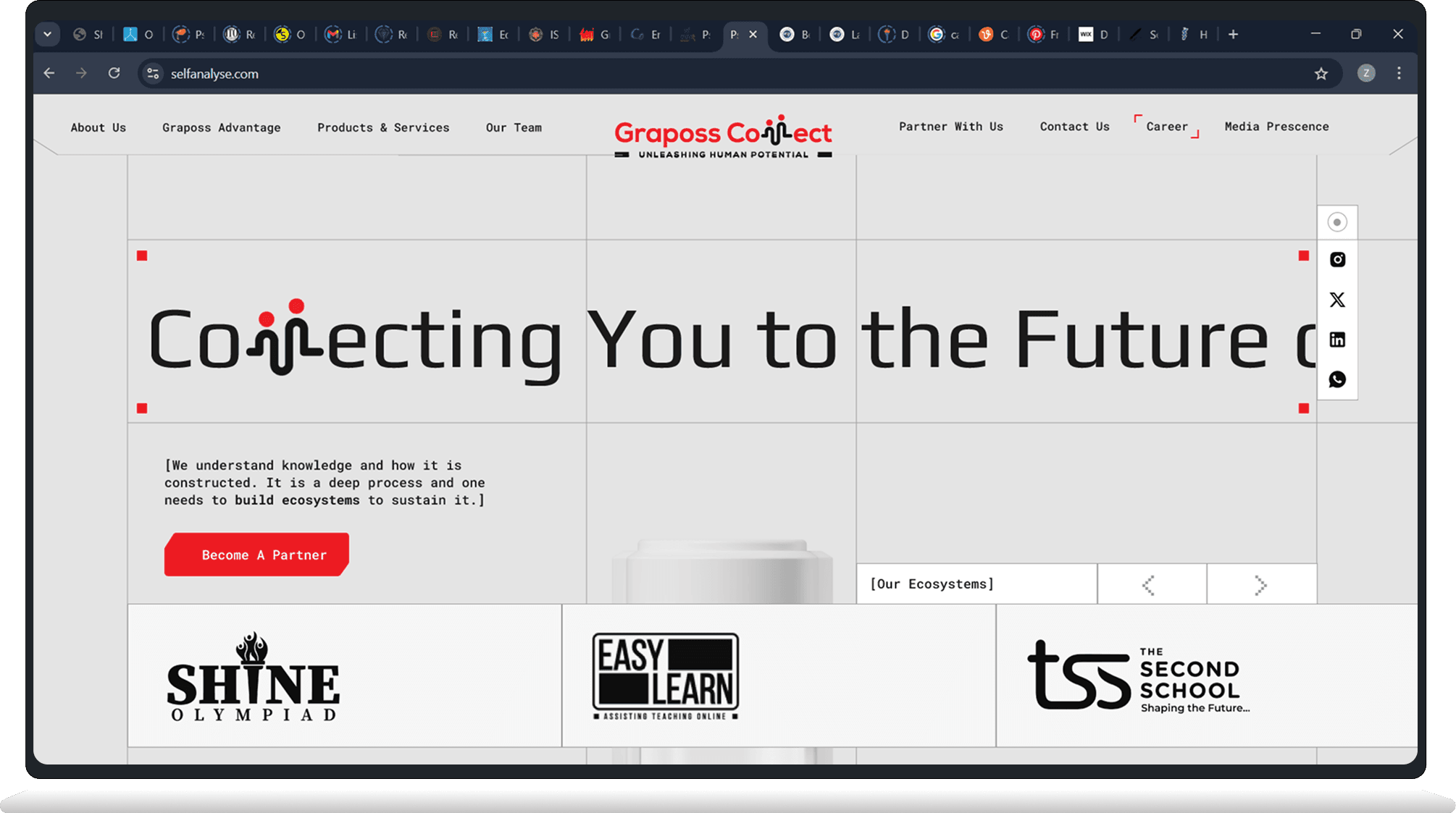
Graposs Connect works across education and technology and has a real partner network doing real things. You wouldn't know any of that from the website, which looks like it was assembled from the same "business website" template pack about forty other companies are also quietly using.
This is a proposed redesign: one home page and eight sections, no new features, just an actual point of view about how the thing should look and feel.
02 / DIRECTION
The live site does everything right and says nothing. Rounded sans-serif, white sections, a six-item menu, the usual cast of stock photos smiling in blazers. It's a firm handshake of a website — perfectly fine, forgotten in four seconds.
The proposal keeps every fact and swaps the personality: monospace type, a visible grid, red as the only colour allowed an opinion, motion instead of stillness. Same company. Louder shirt.
03 / A HOME THAT MOVES

Connecting You to the Future. The headline runs across the fold as a marquee — oversized, a little relentless, exactly the kind of line a client usually asks you to tone down.
Beneath it, the ecosystem — Shine, Easy Learn, The Second School, eClara, Naukri Connect — turns on a carousel instead of just standing there as a wall of logos. Small thing. Still better than a wall of logos.
04 / THE BIG IDEA, HELD
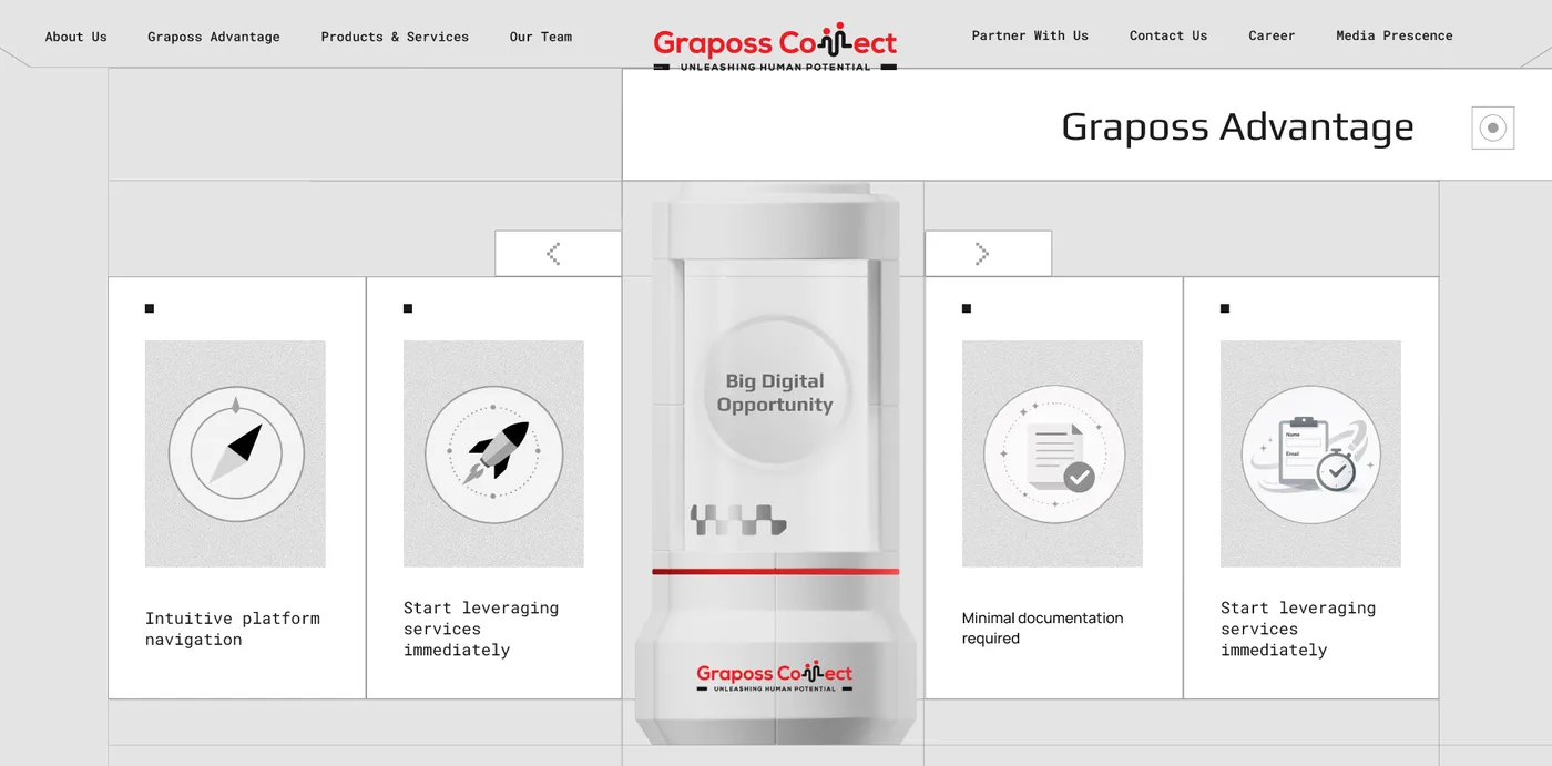
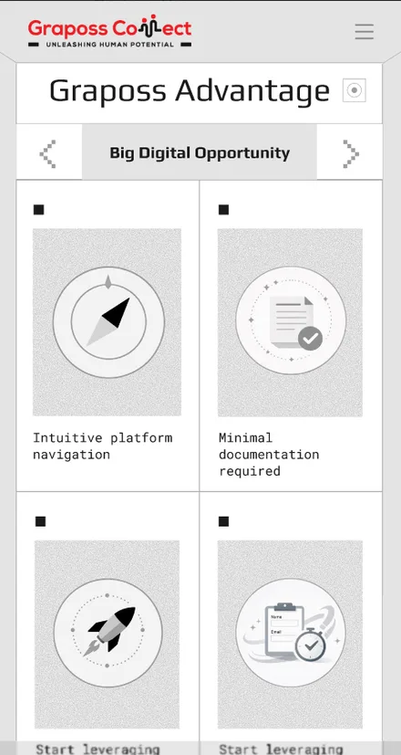
Graposs Advantage. The big pitch sits in a capsule dead centre, literally held, while four supporting points fan out beside it like they're standing guard. Slightly dramatic. About as dramatic as "big digital opportunity" deserves.
Intuitive navigation, immediate service, minimal documentation, fast onboarding — four lines that would've vanished into a bullet list get a card each instead, mostly so nobody scrolls past without at least feeling a little targeted.
05 / PRODUCTS, ONE AT A TIME
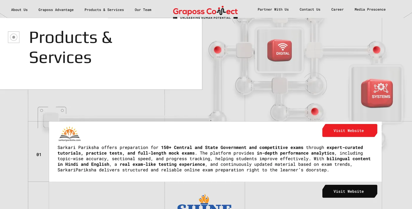
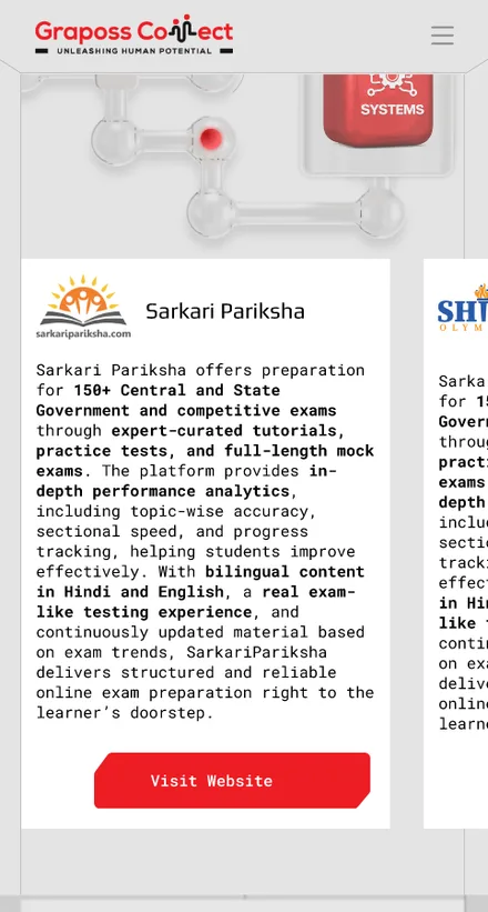
Products & Services. Eight different businesses used to sit in a grid, same size, same weight, same half-second of attention each. Now every one gets its own full-width, numbered panel — logo, a real description, one button — so for a few seconds, each product gets to pretend it's the only thing the company makes.
The 3D DIGITAL and SYSTEMS objects sit in the header mostly because a floating 3D icon is a very convincing way of saying "we do serious things."
06 / ONE CAPSULE, FOUR ANSWERS

About Us. Who We Are, What We Do, Our Vision, Our Mission used to be four paragraphs on the way down a long page. Now they're tabs around one capsule — the whole personality quiz, no scrolling required.
Switching a tab swaps the copy and nudges a little pixel-art icon into a new pose. Small detail, does most of the work of feeling alive instead of read once and forgotten.
07 / FACES THAT TURN OVER

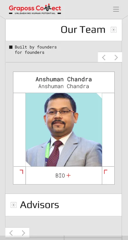
Our Team. Built by founders, for founders — every member gets a card with a portrait and a name, and the bio stays politely out of sight until you ask for it.
Flip the card on BIO+ and you get the full biography and a LinkedIn link. Nobody's forced to read six paragraphs about a stranger — but it's there if you're the type who reads About pages. No judgement.
08 / PARTNER, HIRE, CLOSE

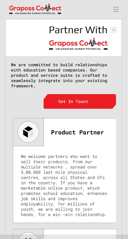
Partner With Us · Career · Media. Three different things — become a partner, apply for a job, believe we're legitimate — living in the same long scroll: partner tiles, a careers section with real listings and an application form, then a press ticker name-dropping Dainik Bhaskar, Hindustan Times, The Indian Express and The Hindu.
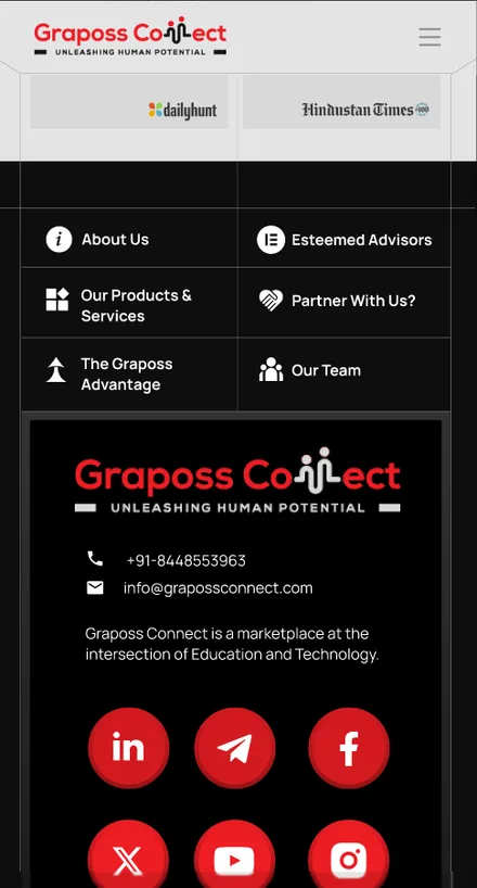
It all lands in a dark footer that flips the whole colour scheme — the one part of the page that stops performing and just quietly hands over contact details and social links, like it's tired too.
09 / ON THE PHONE
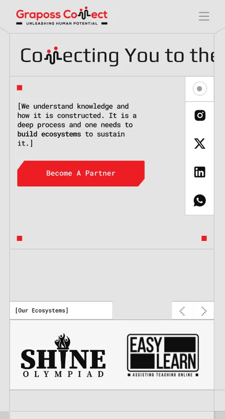
The whole system folds down to the phone. Every screen keeps the same bones as desktop — hero, advantage, products, team, partner, footer — just stacked, because that's what phones are for.
10 / PROCESS NOTE
The content was never the problem — the company has a genuinely good story. This is what happens when you give that story a website that isn't afraid of a bit of personality. Nobody asked for this rebuild. I did it anyway, because red and monospace type make me unreasonably happy.
[ Proposed direction. Every product name, partner and press mention is drawn from the live site. ]
HAVE A DIFFICULT IDEA?
LET'S MAKE IT CLEAR.
Delhi-based UI/UX and Product Designer specializing in dashboards, SaaS systems and design-to-production workflows.