WHITELABEL
(ECLARA)
One interface, resold to many academies. Every decision had to survive dozens of businesses running their own operation inside the same shell.
- ROLE
- SOLE UI/UX DESIGNER
- SCOPE
- ADMIN DASHBOARD
- SURFACE
- RESPONSIVE WEB
- TYPE
- MULTI-PRODUCT SAAS
01 / BRIEF
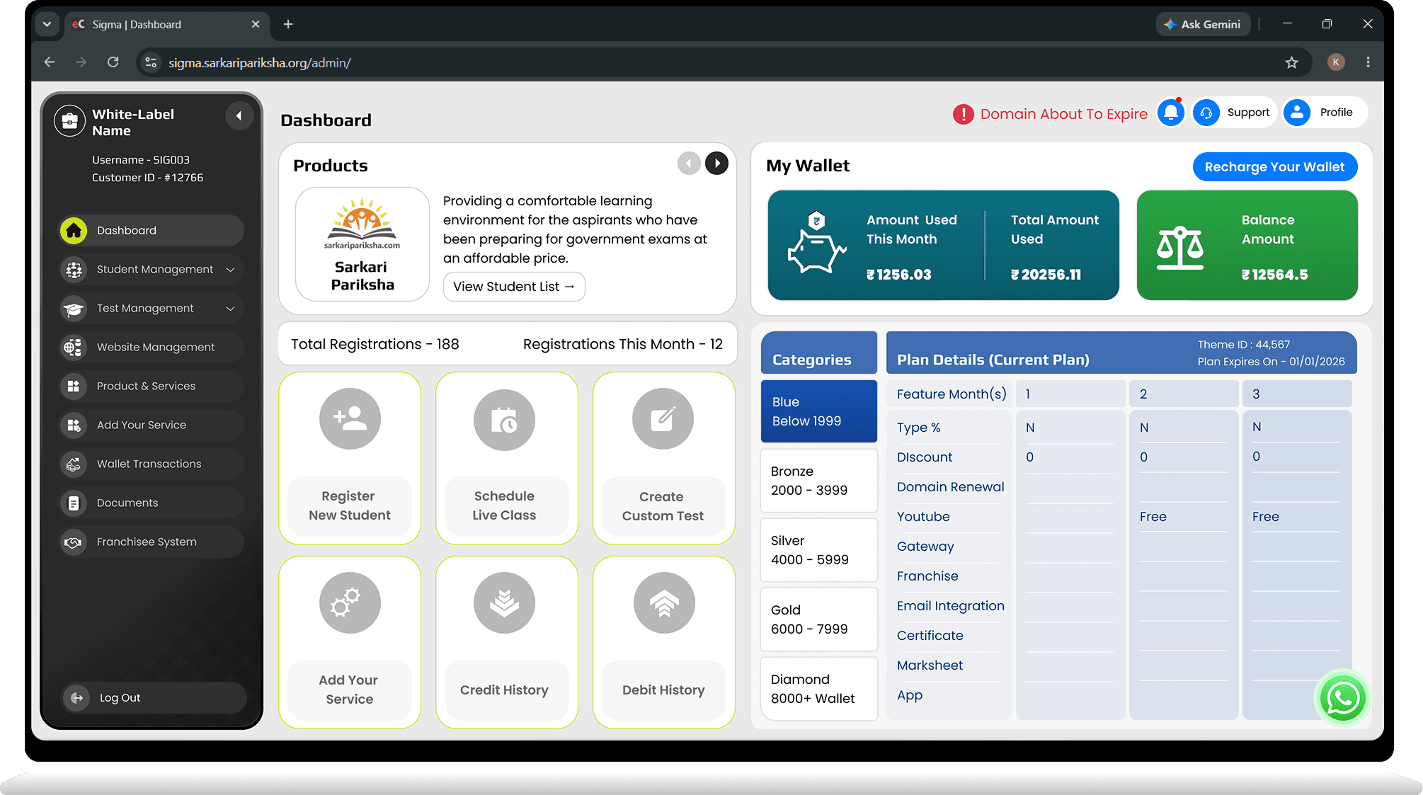
Eclara is a whitelabel education platform. An academy buys it, puts their own name on top, and runs their students, tests, wallet and website through it. The product I inherited worked — it had simply grown one page at a time for years.
Fourteen sidebar items sat at equal weight. Some pages had no sidebar entry at all and could only be reached through text links floating in the top-right corner of another screen. Forms ran as long single columns. A second product — the franchisee system — had been bolted on with its own conventions. Nothing was broken. Everything was scattered.
02 / CONSTRAINT
A whitelabel cannot be designed for one customer. The same shell ships to every academy, so each decision had to hold for the reseller with twelve students and the one with several thousand, for the operator who lives in the wallet and the one who only ever creates tests.
Requirements kept surfacing mid-build, each one legitimate, each one belonging to a different kind of user. Most of this project was months of discussion and rework — passing a single interface through that mesh until it satisfied all of them without collapsing into settings.
03 / DAY ONE
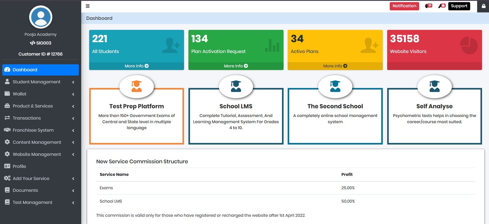
The dashboard sets expectations for everything behind it. The original borrowed an admin template's palette — four unrelated colours competing for the same glance.
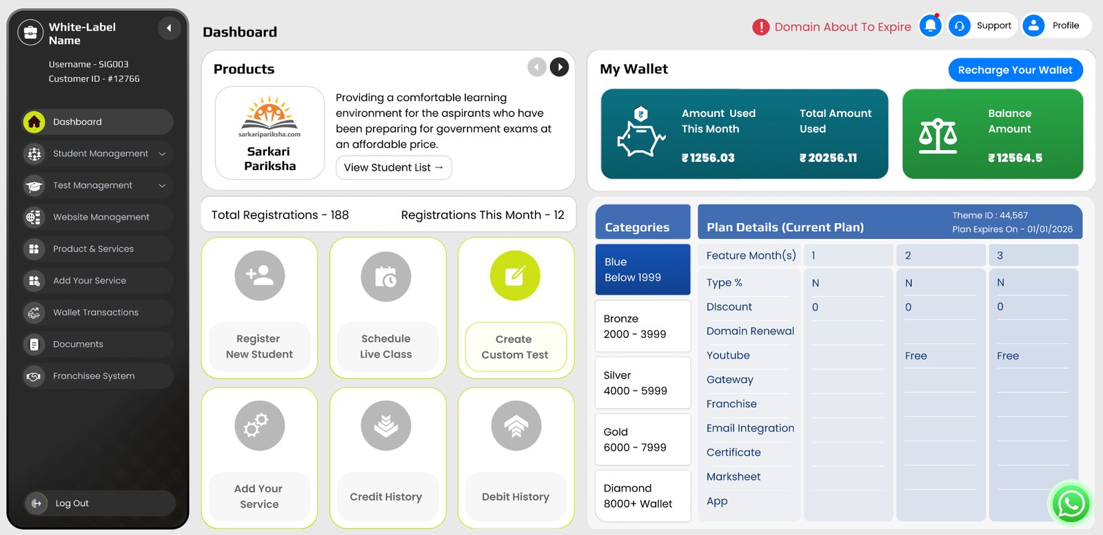
The rebuild gives the operator what they actually open the product for: balance, products, and the three things they do most.
04 / TESTING ENGINE
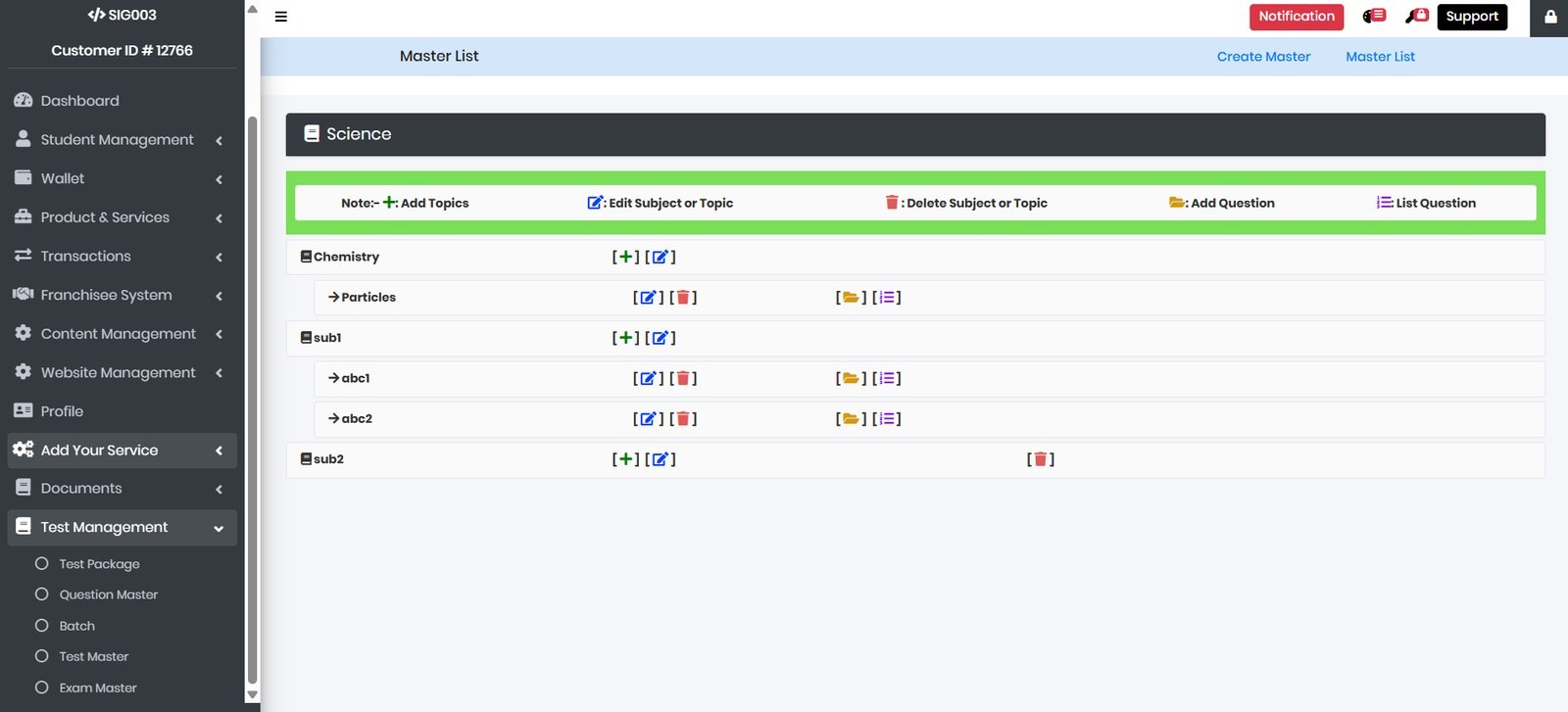
The deepest work in the project. The old module spread across five entries — Test Package, Question Master, Batch, Test Master, Exam Master — mostly forms and tables. Its question list needed a legend bar printed across the top to explain what its own icons meant, and its create/list pages lived as text links rather than navigation.
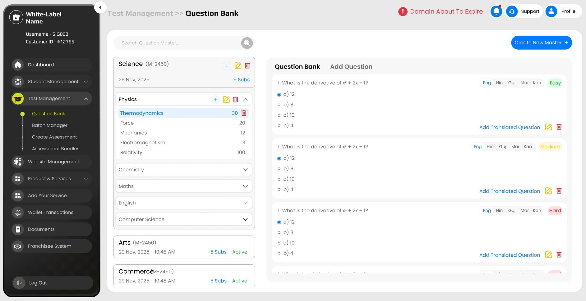
An interface that has to document its own icon vocabulary on screen has already lost. The rebuilt Question Bank makes the hierarchy legible — subjects expand, topics carry their own question counts — and puts the questions themselves on the page, with their five language variants and difficulty visible without navigating away.
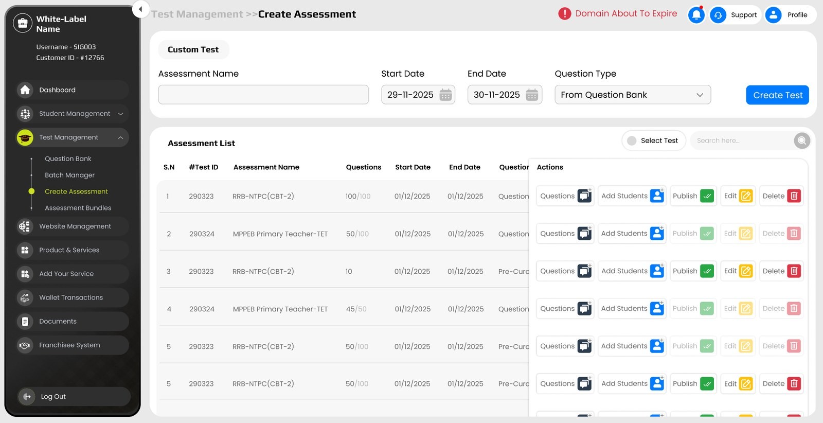
Action Tables. Test creation was rebuilt rather than renamed — every assessment is one row of decisions: questions, students, publish, edit, delete, all in place.
The multi-page flow collapsed into a table you act on, so a test never has to be opened just to be managed.
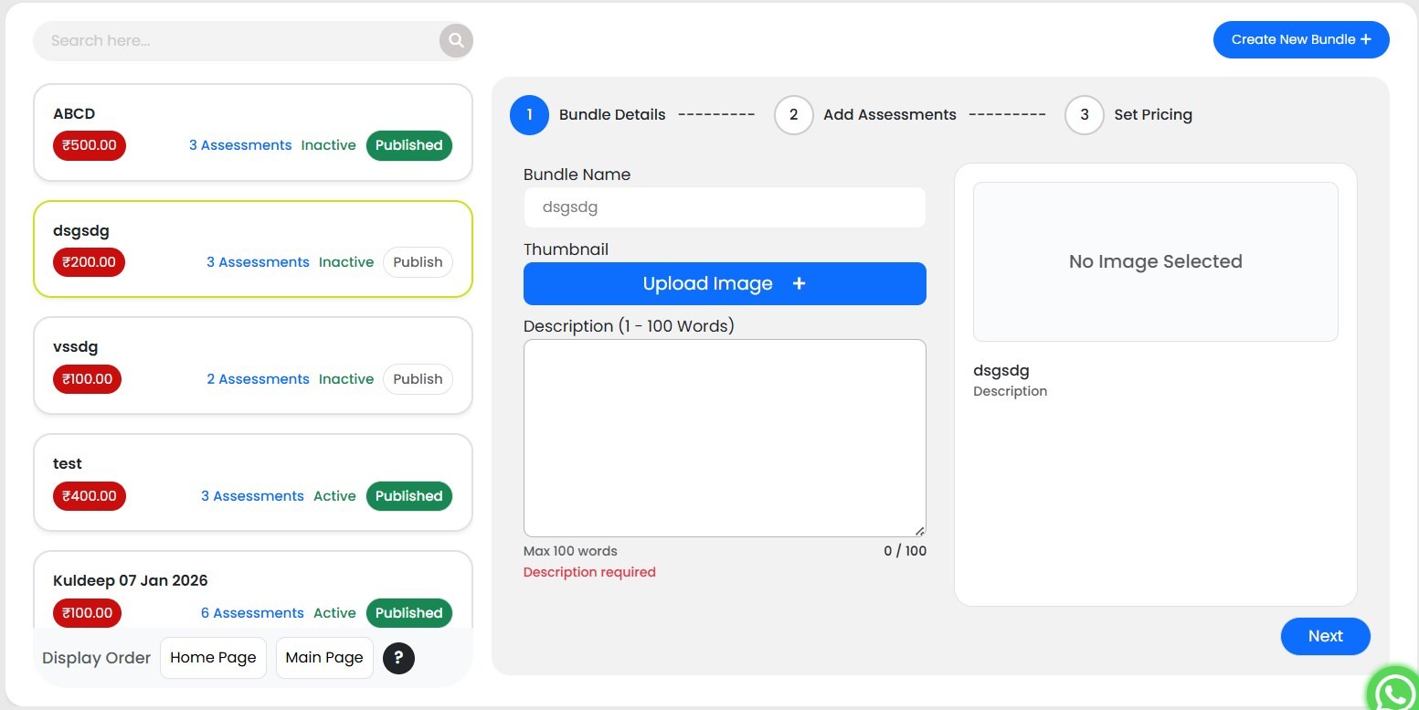
Bundle Wizard. Packaging assessments for sale became a three-step wizard — details, contents, pricing — instead of a form.
The live bundle list sits beside it, so pricing a new bundle happens next to the ones already published.
05 / SIX PAGES, ONE SCREEN
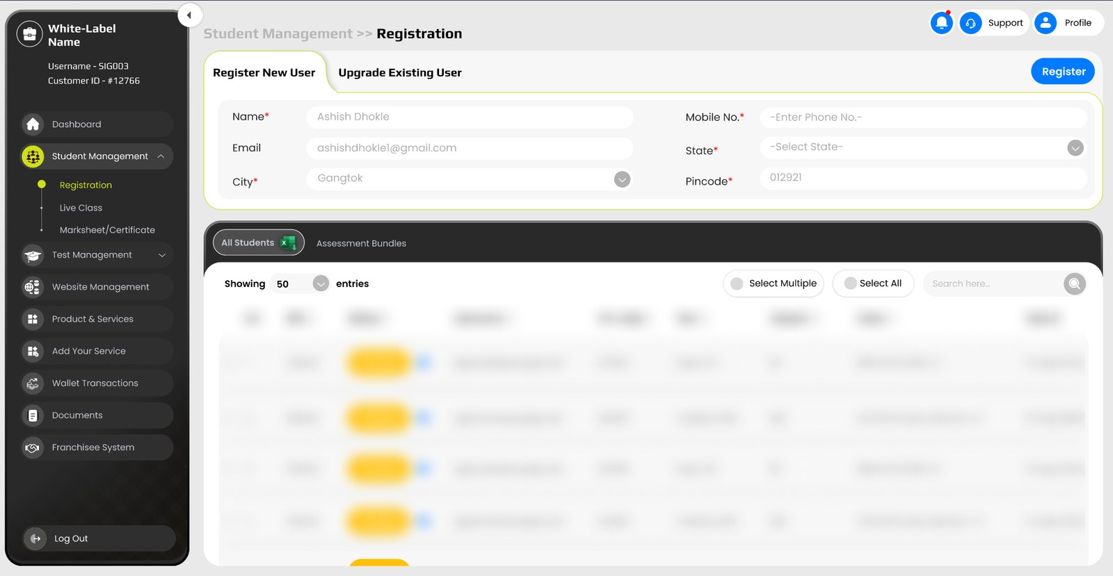
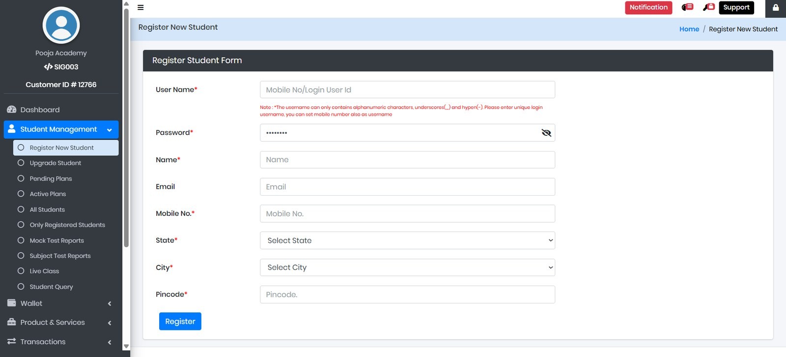
Registering a student, upgrading one, and finding one lived across six separate pages — register, upgrade, all students, only registered, pending plans, active plans.
They are the same job. They are now one screen — two tabs above the live student table, so the record you just created is already in front of you.
06 / THE PRODUCT INSIDE THE PRODUCT
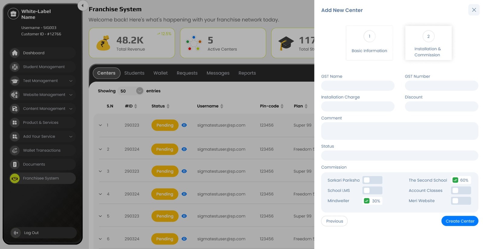
Resellers have resellers. The franchisee system was a second product wearing the first one's clothes — five pages with their own patterns for centres, wallets, requests and two separate histories.
Rebuilt as a single workspace: centres, students, wallet, requests, messages and reports as tabs, and a centre created in a two-step drawer — commission structure included — instead of a page.

07 / TEN PAGES OF TOGGLES
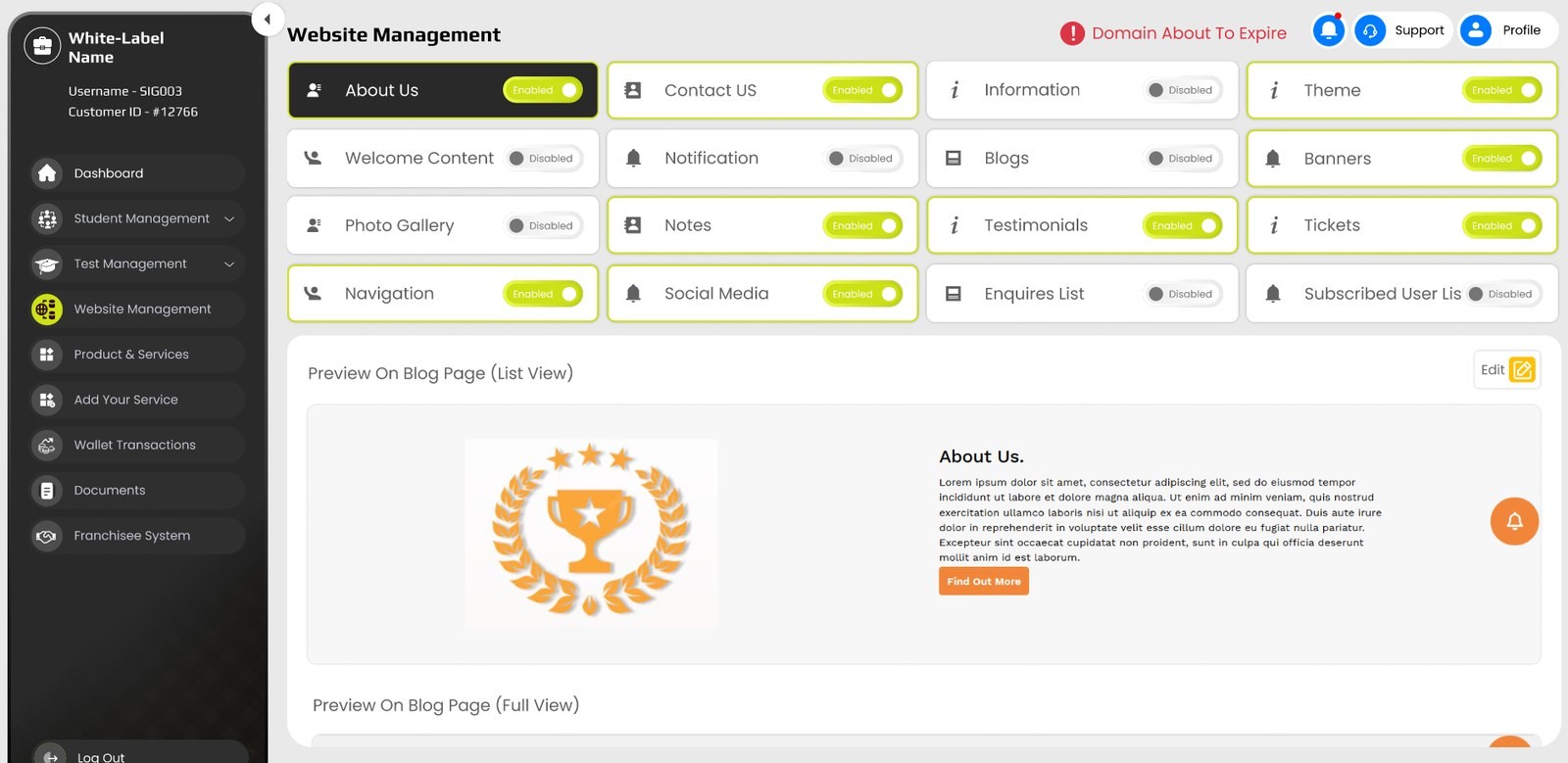
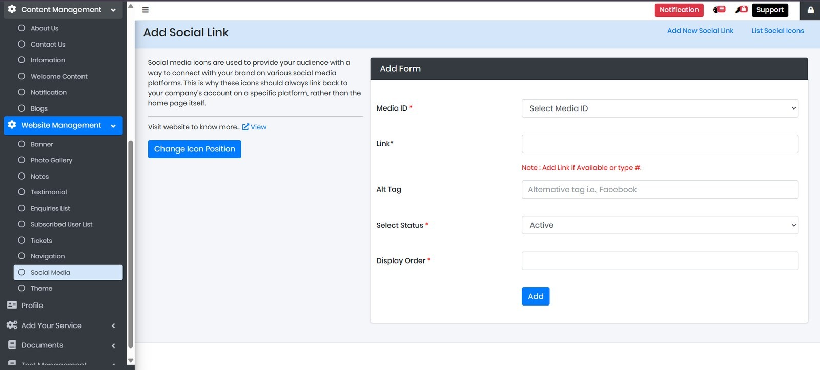
Each piece of the academy's public website — banners, gallery, notes, testimonials, navigation, social, theme — had its own page. Turning one on meant finding it first.
The rebuild puts every switch on one board, with the editor for whichever one is selected directly beneath it. Ten pages became a panel.
08 / THE REST OF THE MESH
The same treatment, applied to money, identity, and the academy's own catalogue of services — quieter work, but each screen absorbed several pages on its way here.
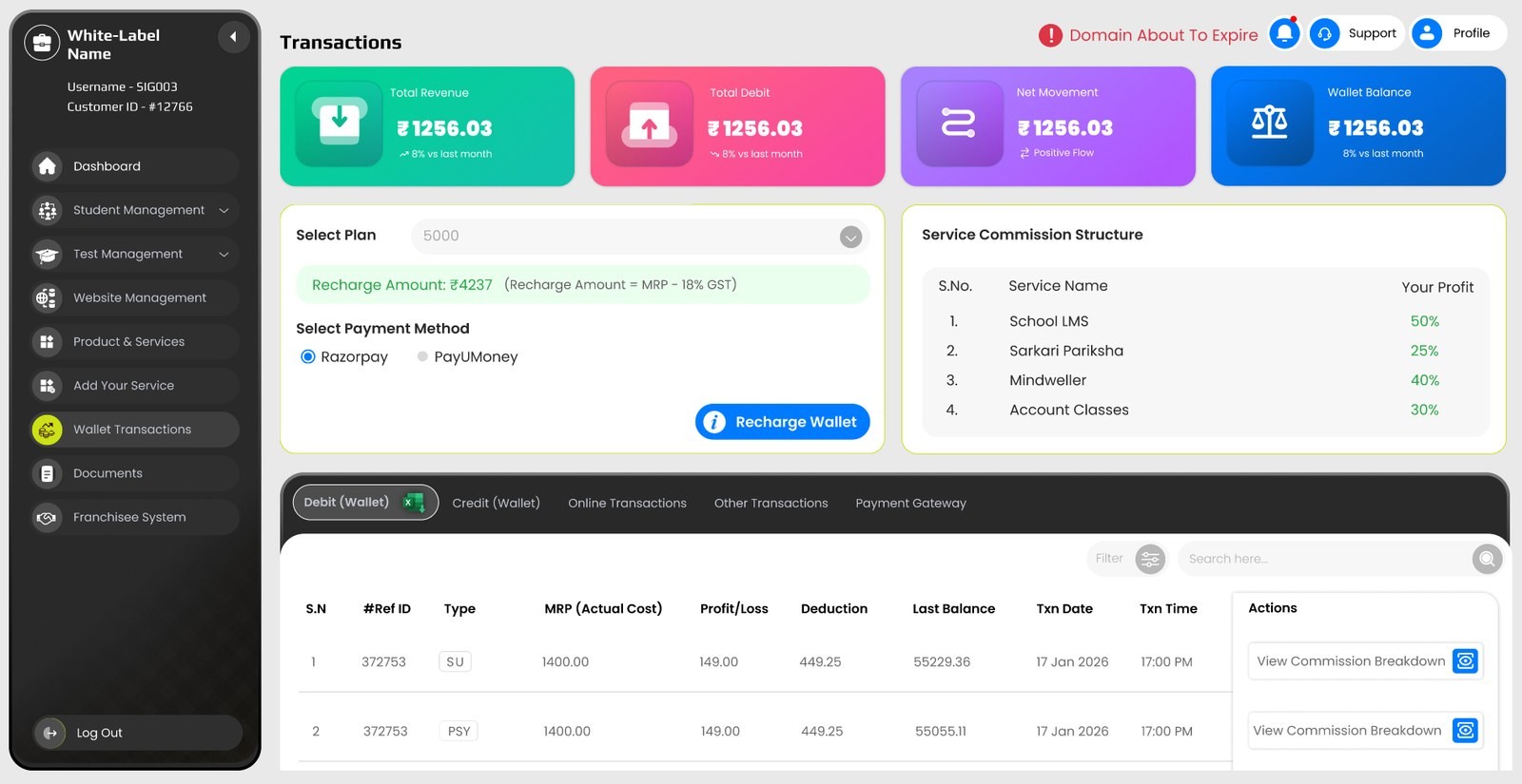
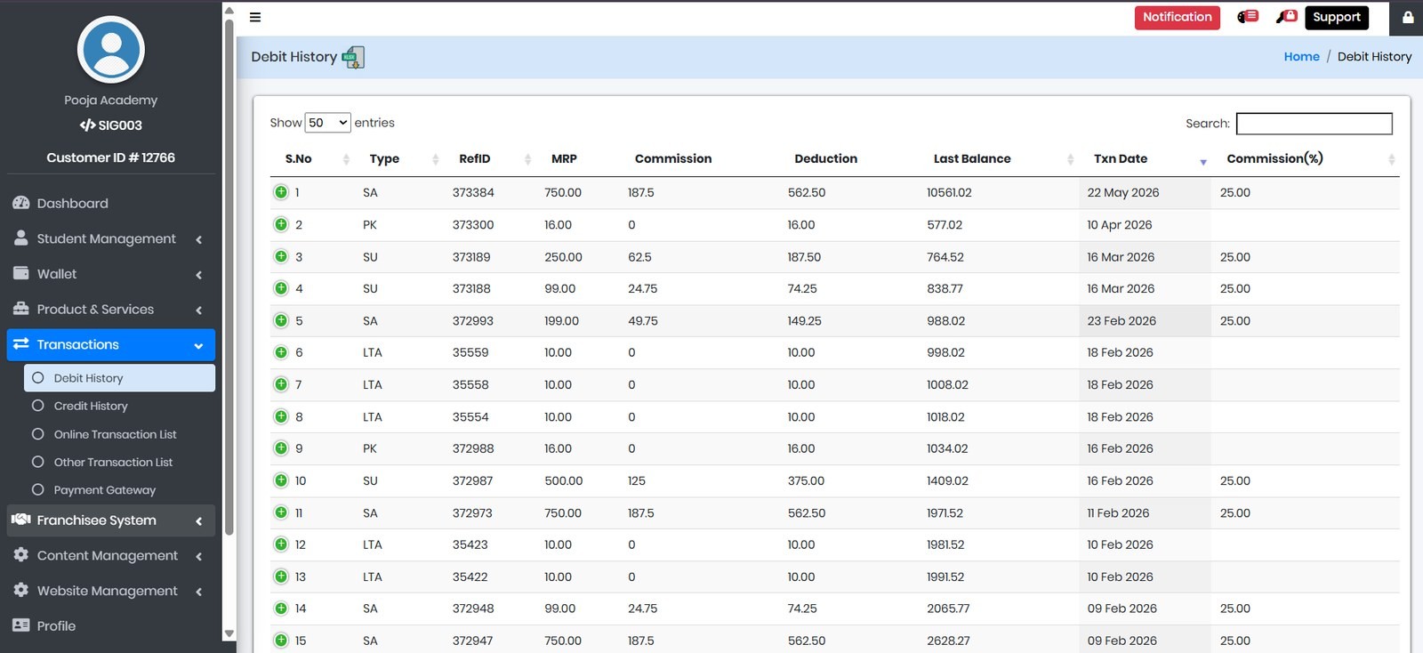
Transactions. Wallet summary, online recharge, recharge history and debit history were four pages describing one flow of money. Now a single workspace — revenue strip on top, recharge desk beside its commission structure, every history a tab.
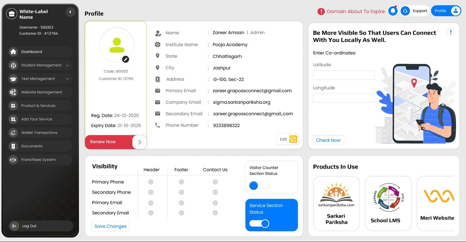
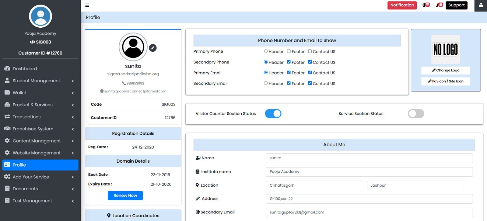
Profile. Identity, domain metadata, contact-visibility toggles and an "about me" form were flattened into one long page.
The rebuild separates who the academy is from what it shows — an identity card with renewal surfaced, a visibility matrix, and the products in use at a glance.
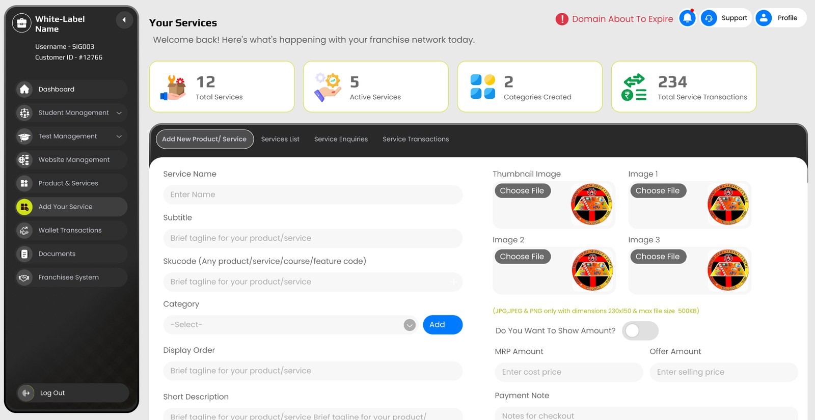
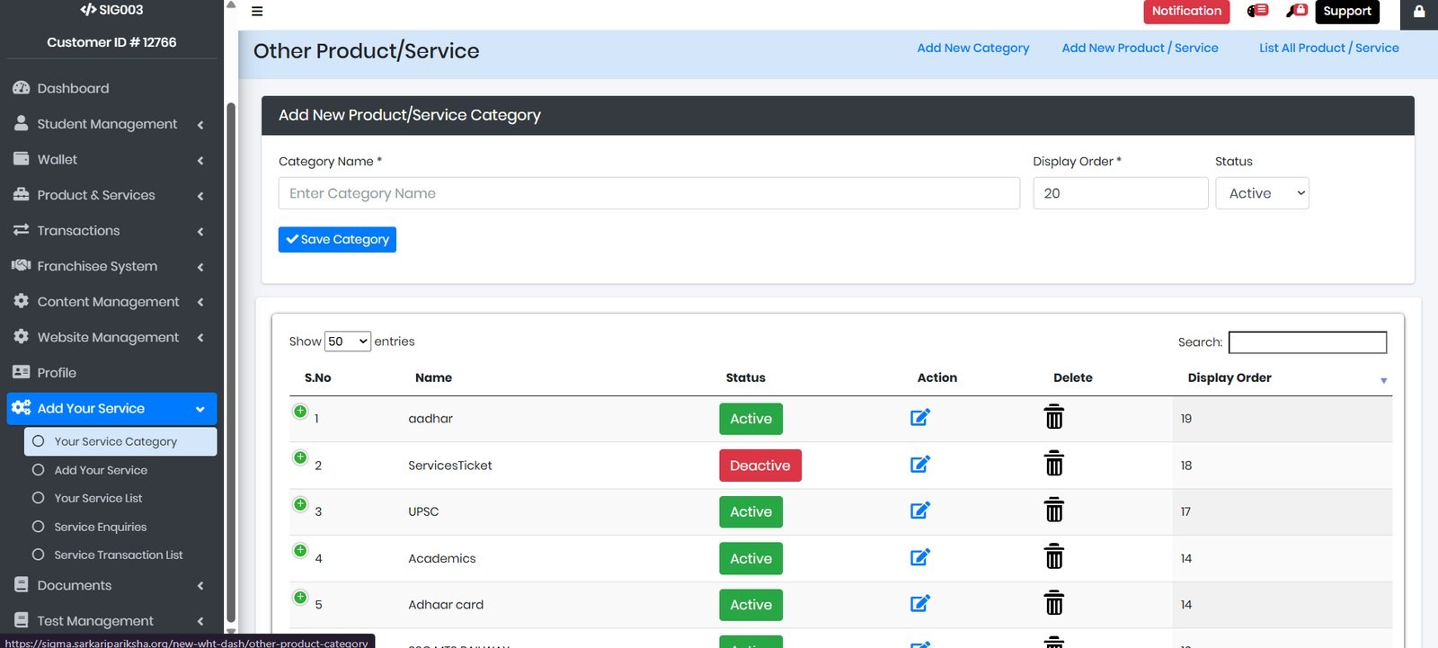
Your Services. Academies sell more than courses, so Eclara lets them list their own. That catalogue was spread over category, service, enquiry and transaction pages.
One workspace now carries the stats strip and all four jobs as tabs above a single form.
09 / BUILT FROM NOTHING
Support had no interface. Queries arrived by phone and stayed there.
The ticketing workspace separates the three audiences that were previously one undifferentiated pile — the operator's own queries, their students', and their centres' — with status filters and categories that make the pile triageable.

10 / PROCESS NOTE
What this project taught me is that whitelabel design is not a styling problem. It is the problem of holding many businesses in one structure without letting any of them feel like an afterthought.
[ Consolidation counts are accurate. The number of meetings is not included, for morale reasons. ]
HAVE A DIFFICULT IDEA?
LET'S MAKE IT CLEAR.
Delhi-based UI/UX and Product Designer specializing in dashboards, SaaS systems and design-to-production workflows.