NAUKRI CONNECT
A categorized current-affairs section and the registration gate behind it — designed from a blank page and shipped inside a product whose visual language already existed.
- ROLE
- UI/UX DESIGNER
- SCOPE
- CONTENT PLATFORM
- SURFACE
- RESPONSIVE WEB
- STATUS
- SHIPPED
01 / BRIEF
Naukri Connect runs exam notifications, admit cards and results for government job and school aspirants. It had no current-affairs section — a category most competing portals treat as core reading, not an optional extra.
This is that section: categorized daily updates, a metered feed, and the registration flow that converts a reader into an account — designed end to end and shipped using the palette, type and components the rest of the product already runs on.
02 / SOMEBODY ELSE'S SYSTEM
There was no rebrand here. The maroon-and-pink palette, the logo, the header, the card and button language — all of it existed before this project started and had to keep existing after it.
The job wasn't to design a current-affairs page. It was to design one that behaves like it shipped with the product on day one, using a visual system somebody else already decided.
03 / THE HUB
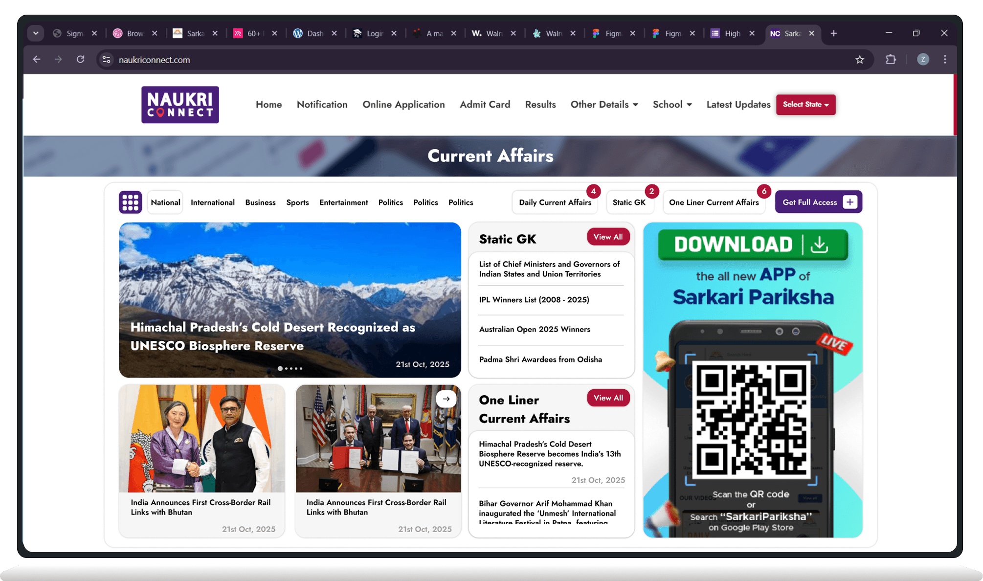
Daily Current Affairs, Static GK and One Liner Current Affairs sit as tabs above the feed, each carrying a live count, so a reader coming back can see what's new before opening anything.
Static GK and One Liner also get their own preview panels beside the main feed — a reader can see what's new in every category without leaving the one they're already reading.
04 / THE FEED
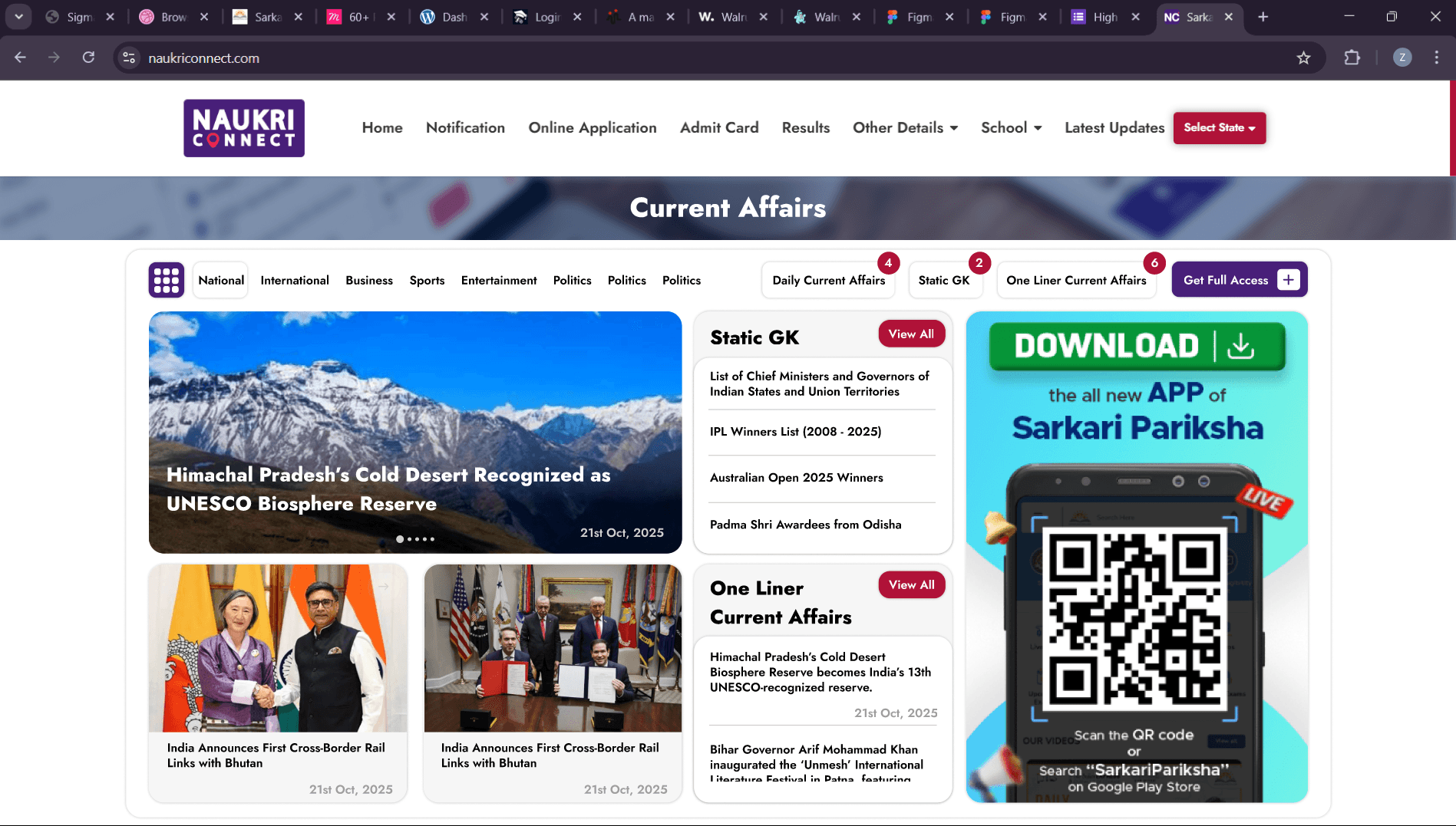
Scroll past the fold and the tabs give way to a plain, scannable grid — one story still expanded, the rest as equal-weight cards with a date stamp.
Nothing here fights for attention. The app-download creative keeps its place in the right rail the whole way down — real inventory the product needed a place for, not a banner squeezed in afterward.
05 / THE GATE
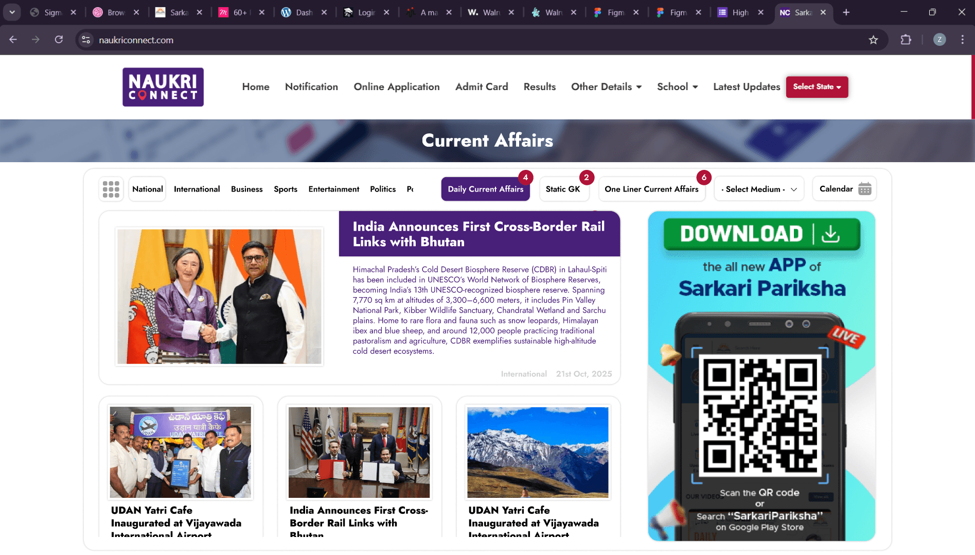
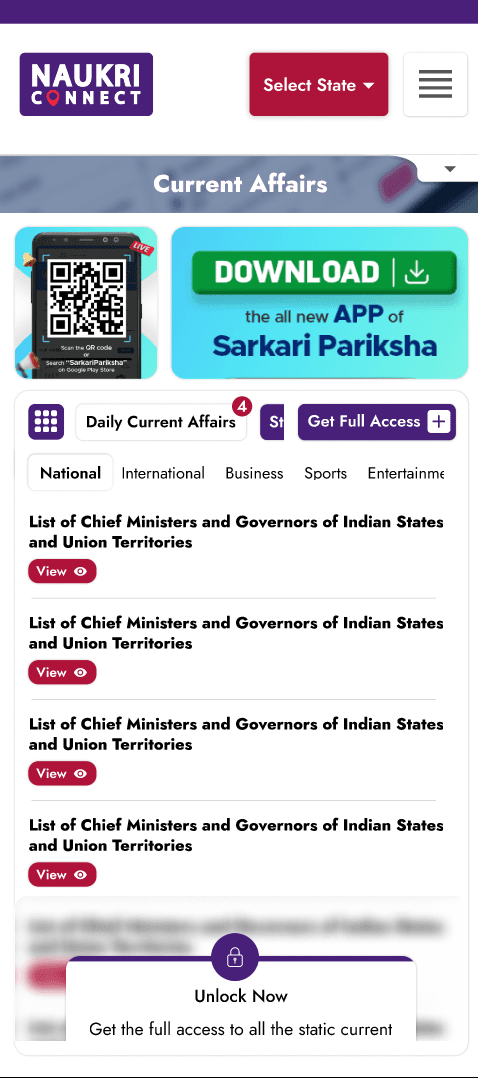
Static GK is metered — four entries visible, the rest sitting behind a blurred preview under a lock. The reader sees exactly what they'd be unlocking before they're asked to do anything about it.
That's the difference between a paywall and a wall: show the shape of what's behind it, then ask.
06 / ONE MODAL, NOT A NEW PAGE
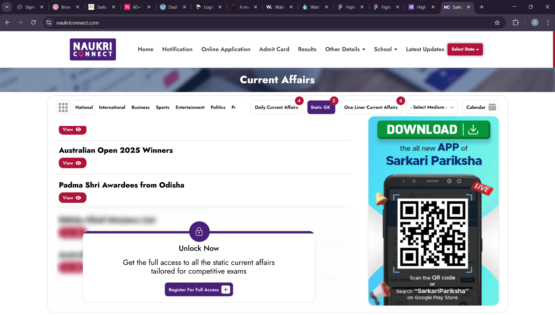
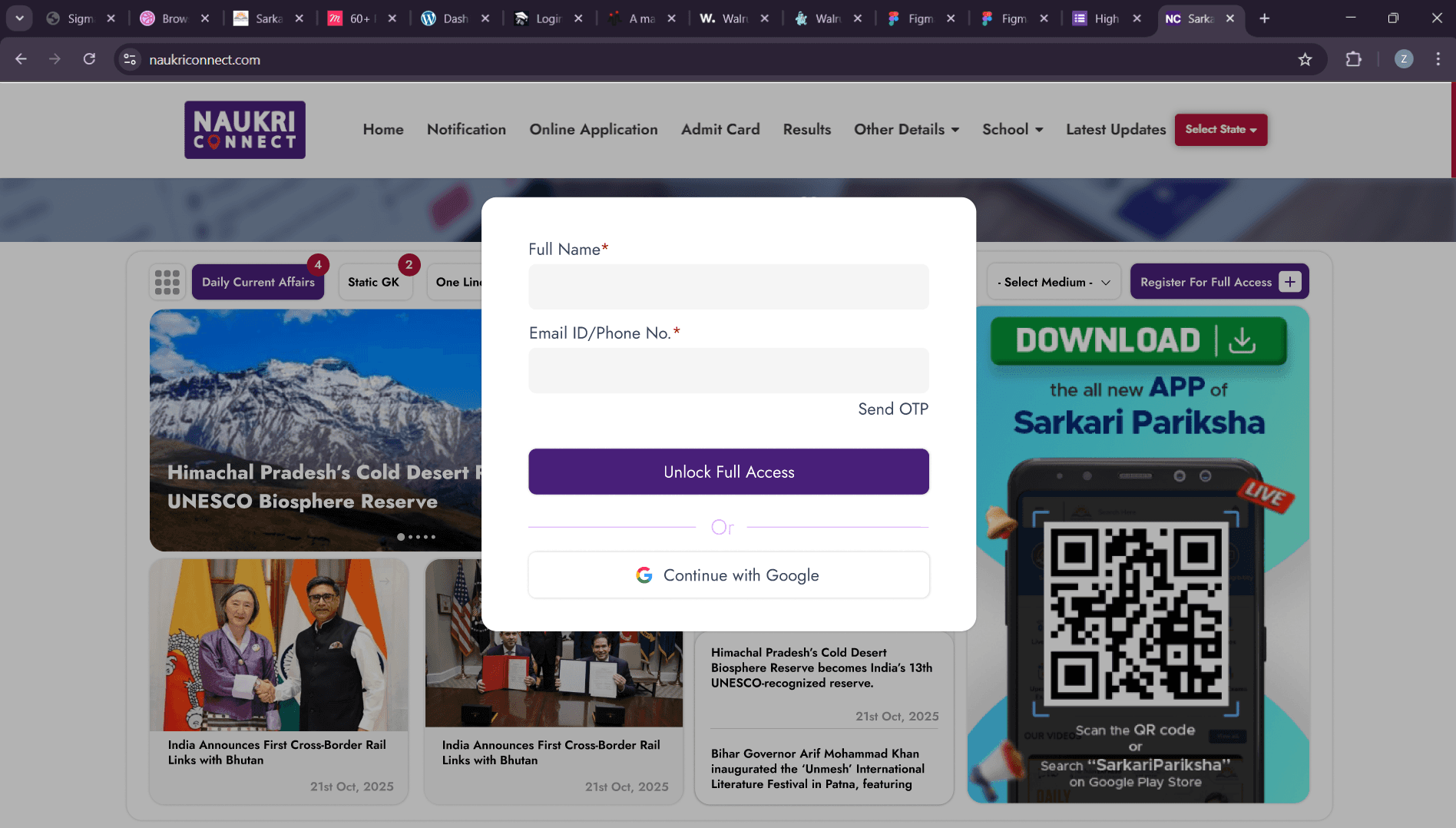
Unlock Now opens straight into a two-field form — name, then email or phone — with OTP or a single Google button as the alternative.
No separate signup page, no second visit. The same overlay that blurred the content is the one that unlocks it.
07 / ON THE PHONE
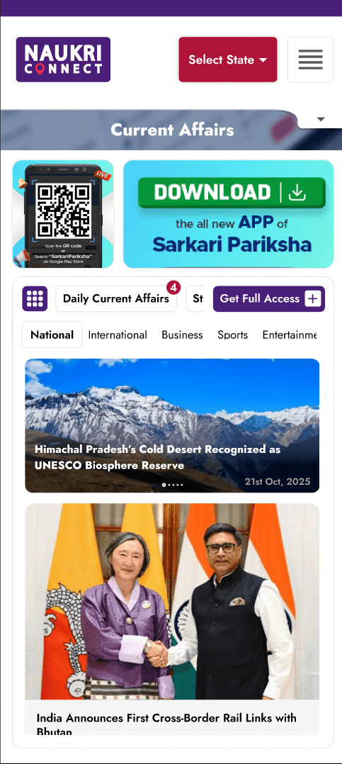
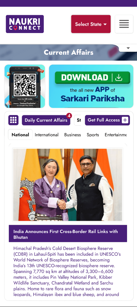
The hub, the gate and an opened article, reflowed to one column — same tabs, same lock logic, same everything, just narrower.
08 / PROCESS NOTE
Categorized news feeds are a solved problem. The actual brief was making an addition to somebody else's shipped product disappear into it — no new colours, no new type, no seam between what existed on Monday and what shipped on Friday.
[ This page is live on naukriconnect.com. ]
HAVE A DIFFICULT IDEA?
LET'S MAKE IT CLEAR.
Delhi-based UI/UX and Product Designer specializing in dashboards, SaaS systems and design-to-production workflows.