iPOINT
INDIA
Creating a digital identity from a blank canvas ? one clear promise, one visual language, and enough structure for a broad learning ecosystem to feel immediately understandable.
01 / BRIEF
iPoint needed more than a collection of service pages. It needed a digital identity capable of holding education, finance, consulting and training without feeling like four unrelated businesses sharing a header.
The project began with no inherited interface system. The work was to create the point of view first, then make every page behave as evidence of it.
02 / DIRECTION
The central idea was orientation before persuasion. A visitor should understand where iPoint can take them before the site starts selling the journey.
That decision shaped the whole system: restrained colour, strong editorial hierarchy, visible routes through the offer and motion that demonstrates relationships rather than decorating empty space.
03 / START WITH ONE PROMISE
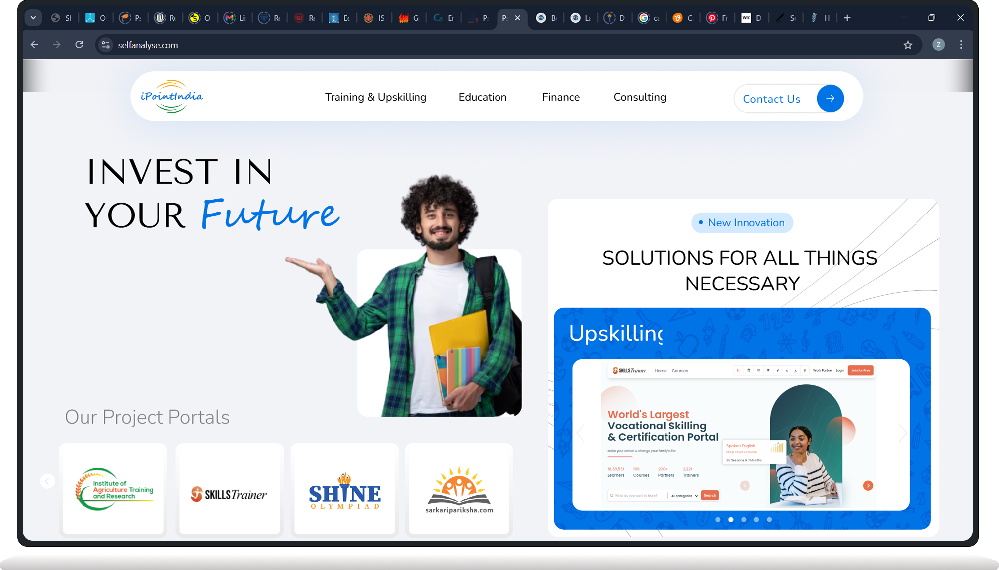
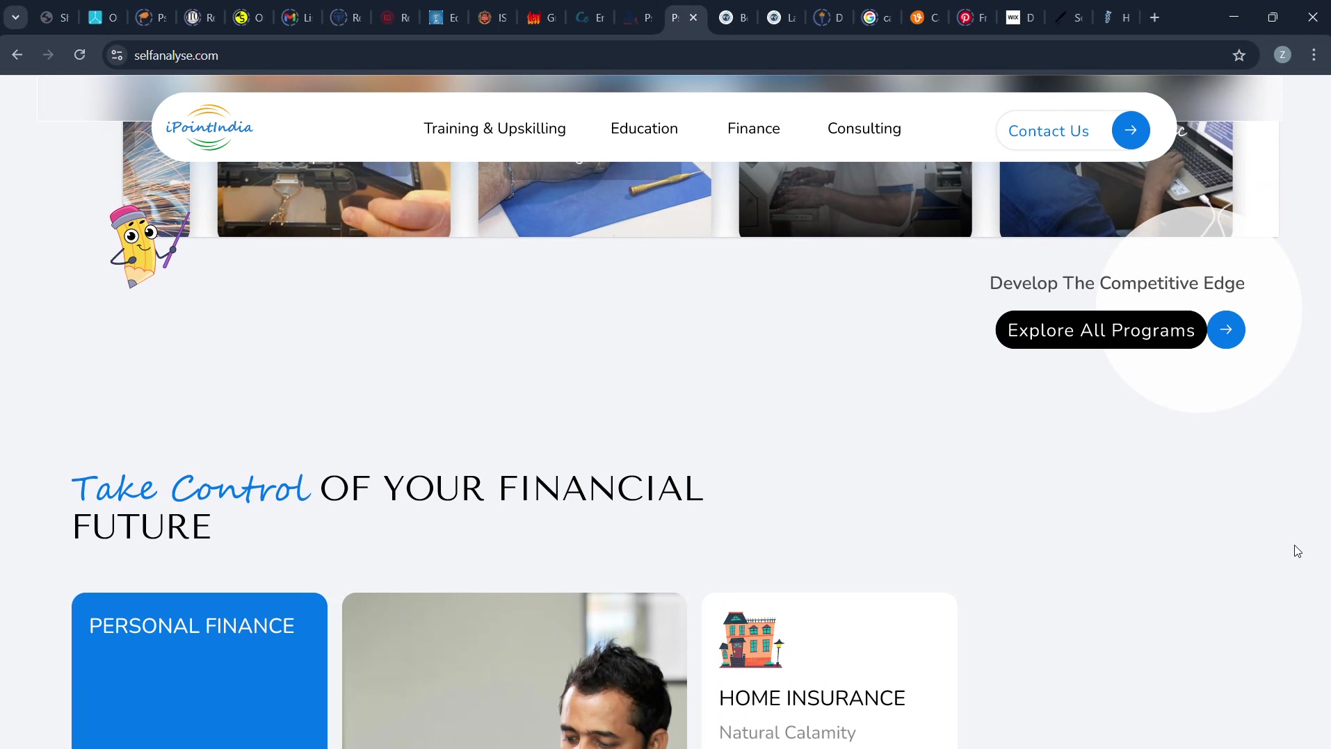
The opening does not attempt to summarize the company. It establishes a useful promise and lets the breadth of the ecosystem appear as supporting evidence. The hierarchy protects the first decision a visitor needs to make.
A focused opening creates confidence. The rest of the site can become richer because the first screen has already supplied orientation.
 HOVER FOR MOTION
04 / MAKE BREADTH SCANNABLE
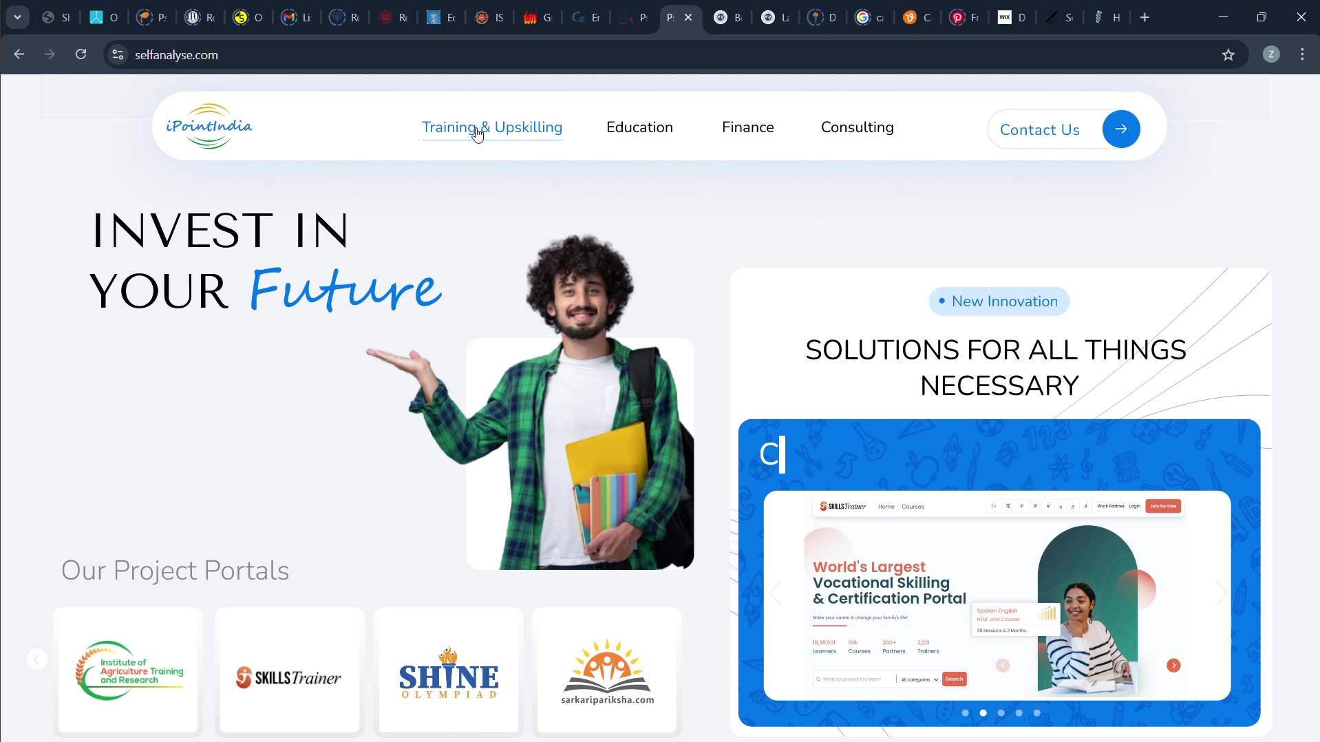
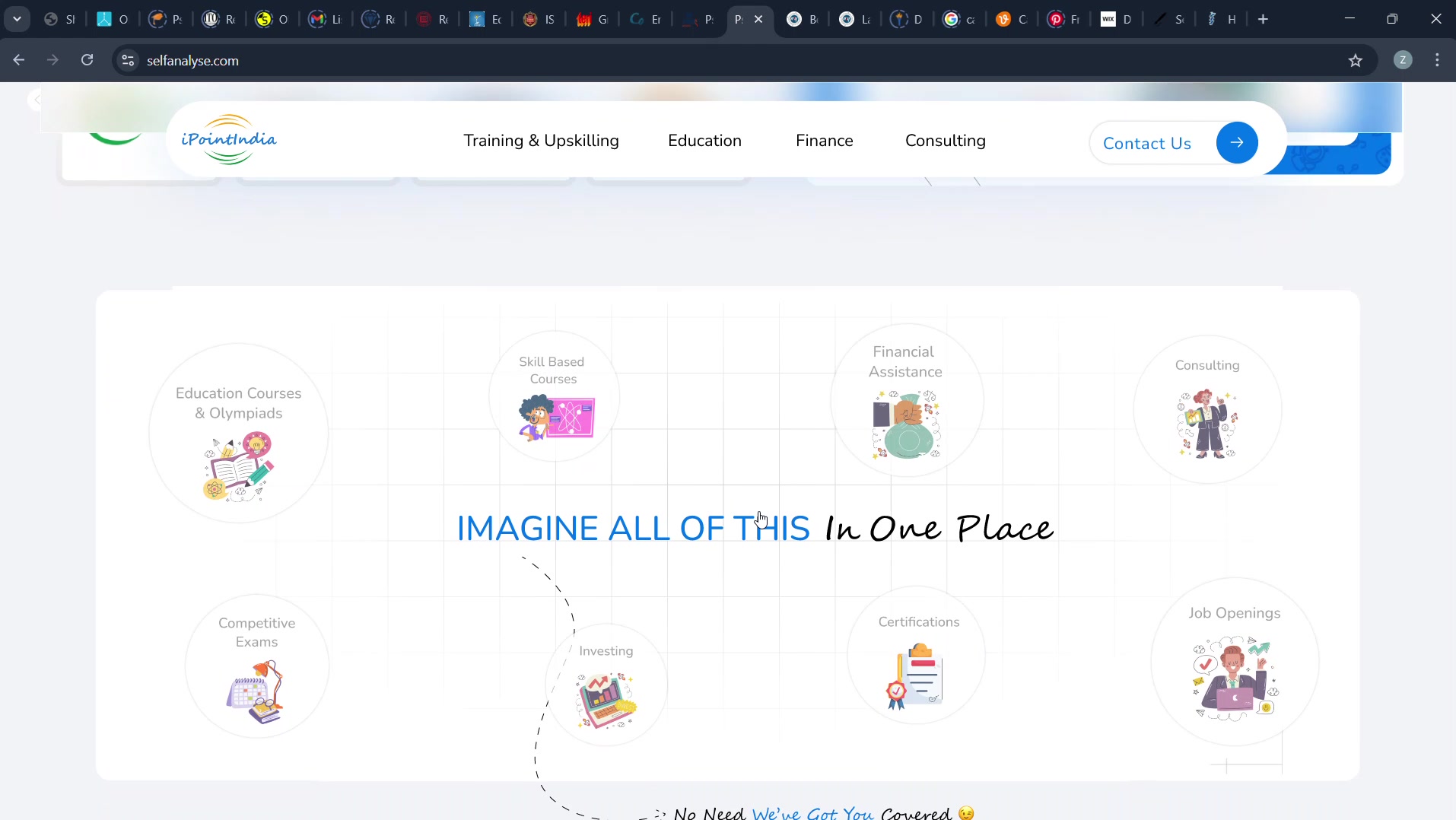
A broad offer becomes credible when people can see its internal logic. Services are grouped as recognisable paths, with repeated geometry and labels creating a rhythm visitors can learn once and reuse.
The cards are not a decorative grid. They are the information architecture made visible.
 HOVER FOR MOTION
05 / DESIGN FOR ORIENTATION
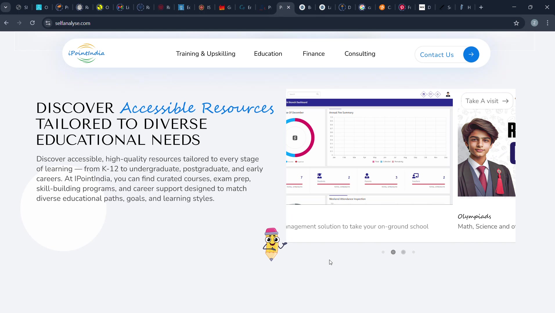
Every page uses the same cues to answer three quiet questions: where am I, what is this about, and what can I do next? Consistent headings, spacing and action placement turn a large site into one guided experience.
Predictability is doing the accessibility work here. The interface spends less of the visitor's attention on learning itself.
 HOVER FOR MOTION
06 / MAKE EXPERTISE EVIDENT
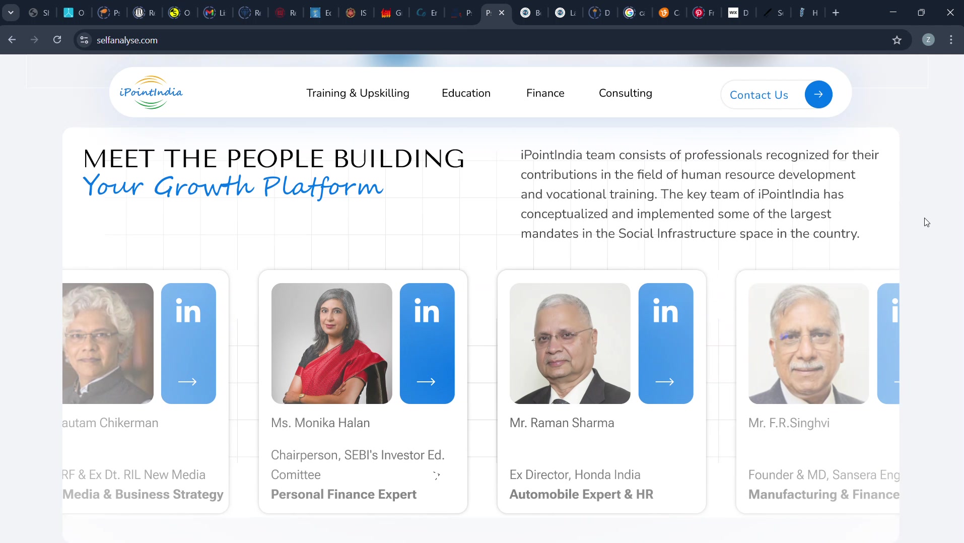
Trust is stronger when it can be inspected. People, programs and proof receive deliberate space instead of being compressed into marketing claims, letting authority accumulate through what the visitor can verify.
The visual system steps back around evidence. Credibility gets the loudest voice in the room.
 HOVER FOR MOTION
07 / KEEP MOMENTUM VISIBLE
A long marketing page fails when its next step only exists at the top and bottom. Calls to action recur at moments of resolved intent, turning conversion into part of the navigation rather than a final demand.
Each section closes one question and opens the next. The page behaves like a sequence, not a pile.
 HOVER FOR MOTION
08 / LET THE SYSTEM HOLD
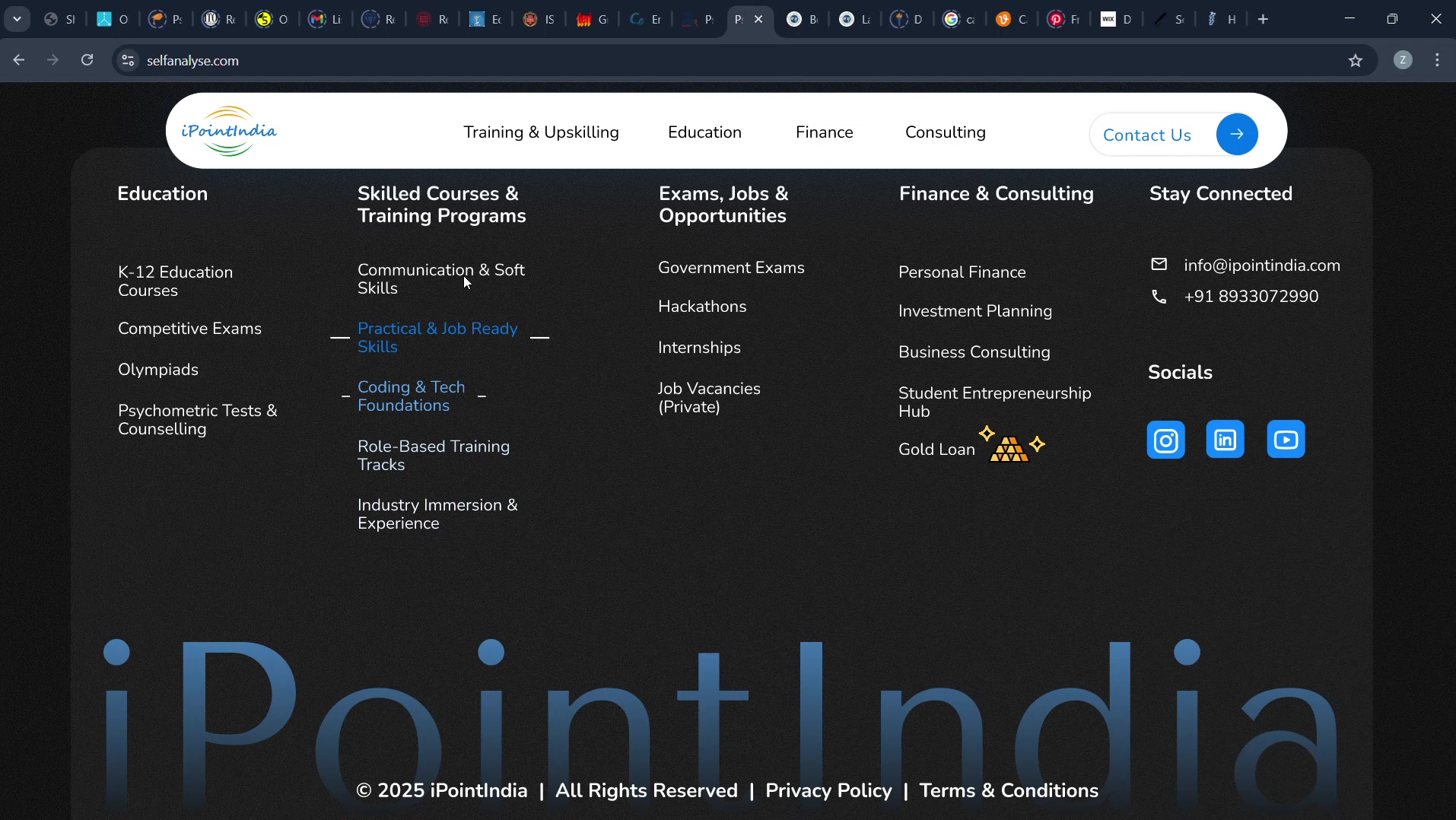
The final measure was consistency across content types. Typography, spacing, imagery, interaction and responsive behaviour follow the same rules whether the page is explaining a service, introducing a person or asking for contact.
What holds the project together is not a repeated component. It is a repeated design decision.
 HOVER FOR MOTION
09 / PROCESS NOTE
Starting from scratch was the advantage and the responsibility. With no inherited interface to blame, every inconsistency would be a decision I had made. The useful work was not drawing more screens; it was deciding which rules deserved to survive all of them.
[ The narrative is intentionally provisional. The design evidence is real; project context and outcomes will be refined with the final case-study copy. ]
HAVE A DIFFICULT IDEA?
LET'S MAKE IT CLEAR.
Delhi-based UI/UX and Product Designer specializing in dashboards, SaaS systems and design-to-production workflows.