TEST SERIES
24×7
A public website, a practice system, and a report that closes the loop. Designed as one product, then coded into the version that is ready to replace the live experience.
- ROLE
- UI/UX + FRONT-END DESIGN
- SCOPE
- MARKETING SITE + ASSESSMENT PRODUCT
- SURFACE
- RESPONSIVE WEB
- STATUS
- CODED / READY TO SHIP
02 / THE SYSTEM, NOT THE SCREEN LIST
The dashboard shares the operational logic of the Whitelabel platform, but the audience changes the design priority. Administrators need control; students need momentum. Navigation, saved syllabus, history and upcoming exams therefore behave as one continuous study state rather than separate modules.
The public homepage and the report extend that state in both directions. One earns the first click. The other makes the completed test useful after the score has stopped being interesting.
03 / EARN THE FIRST CLICK
The old homepage led with passes, price cards and overlapping promotional surfaces. It demonstrated breadth, but asked the visitor to understand the business before choosing an exam.
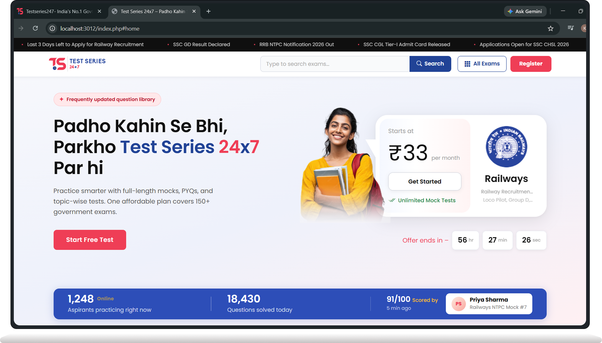
The new direction begins with intent. Exam discovery is the spine; trending categories, the library and access plans support it. Flip the evidence to compare the current public site with the coded replacement.
 HOVER FOR MOTION CLICK FOR MOTION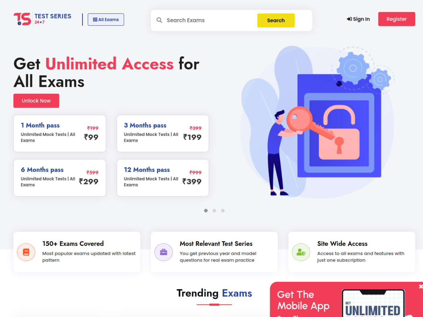
04 / THE DASHBOARD IS A DECISION SURFACE
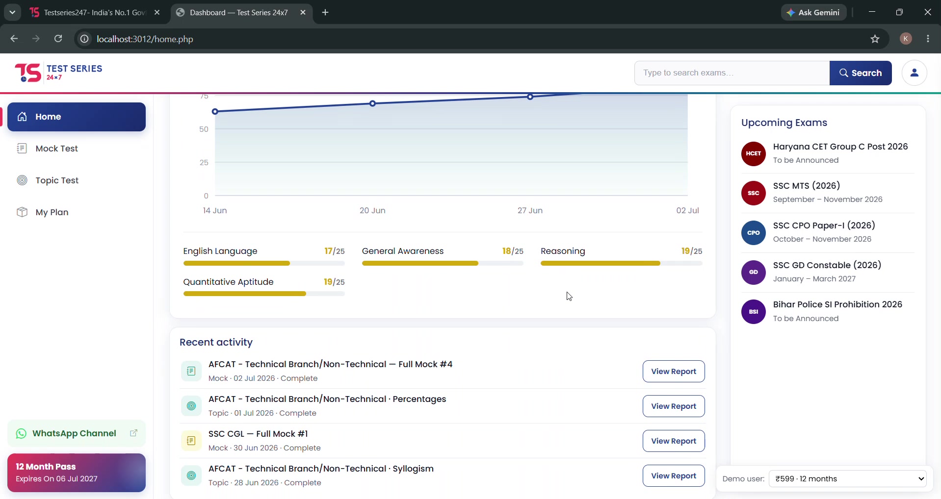
A dashboard should answer “what now?” before it reports “what happened?” The active syllabus and immediate test action sit first; performance trend and upcoming exams provide context without becoming the task.
This is the shared principle with Whitelabel: the shell is reusable, but the hierarchy belongs to the person using it.
 HOVER FOR MOTION CLICK FOR MOTION
05 / ONE SYSTEM, DIFFERENT PRACTICE TEMPOS
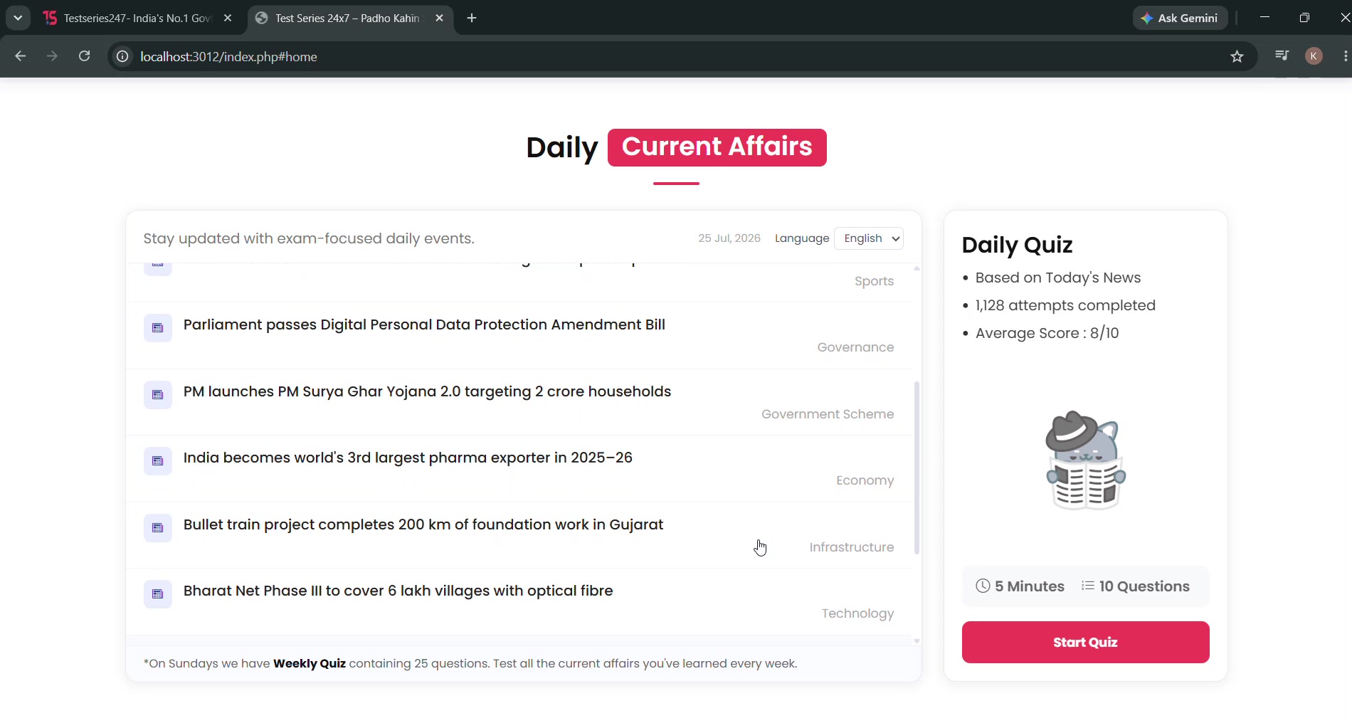
Daily quizzes, weekly current affairs, topic tests and full mocks are not four unrelated products. They are four commitments of time and confidence.
I kept their selection language, history and outcomes consistent, then let each mode foreground what makes it useful: recency for current affairs, subject depth for topic tests, and exam realism for mocks.
06 / MAKE THE TEST DISAPPEAR
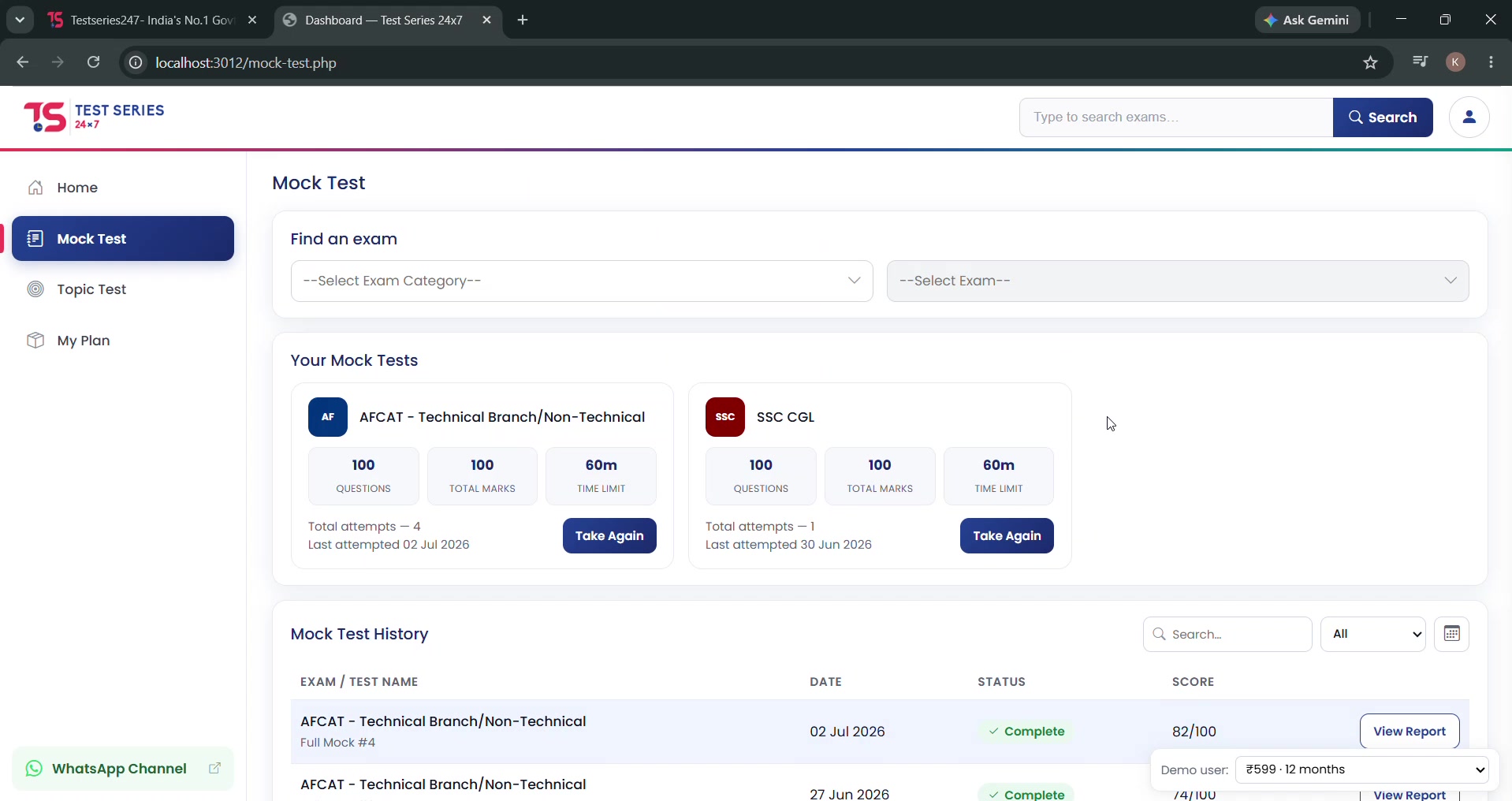
The assessment interface is deliberately quieter than the product around it. Search, filters and history help a student begin; once the test starts, the chrome yields to questions, time and progress.
The interaction model avoids inventing new behavior at the highest-stress moment. Familiar controls are a feature here, not a creative compromise.
 HOVER FOR MOTION CLICK FOR MOTION
07 / A REPORT SHOULD PRESCRIBE THE NEXT MOVE
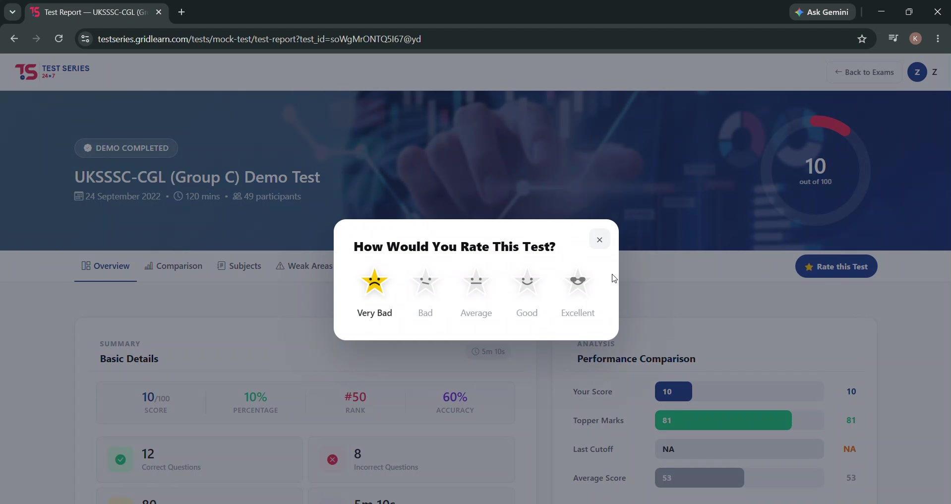
A score is an ending. A useful report is a beginning. The report separates accuracy, speed, rank, subject performance and question review so a student can distinguish a knowledge gap from a time-management problem.
Comparison is used as diagnosis, not decoration. The screen moves from headline result to performance pattern, then back into practice with enough context to choose what to attempt next.
08 / ACCESS WITHOUT A PRICING PUZZLE
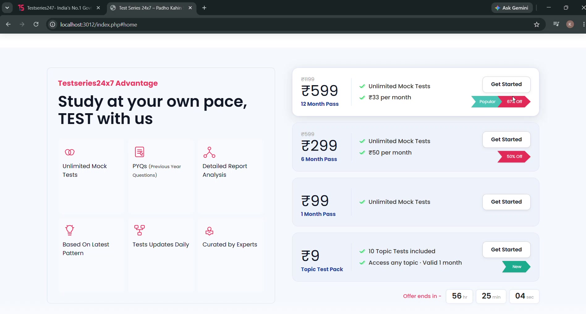
The existing site repeats pass durations as the primary proposition. The redesign explains the access model first, keeps inclusions comparable, and makes the chosen plan visible after purchase.
The decision is reduced to one question: which level of access fits the way I intend to prepare?
09 / DESIGN THROUGH PRODUCTION
I designed the marketing site, dashboard and reporting experience, then used Claude Code and Codex as implementation collaborators to turn the system into working front-end code. The important part was not generating a page quickly. It was preserving the hierarchy, responsive rules and interaction intent while the design became software.
[ The current site is the “before.” The coded redesign is waiting in the wings, behaving very professionally. ]