SHINE OLYMPIAD
A full redesign across four surfaces — the public site, the student dashboard, mobile, and the live exam engine itself — for a platform that was previously running on a generic template.
- ROLE
- UI/UX DESIGNER
- SCOPE
- EDTECH ECOSYSTEM
- SURFACE
- RESPONSIVE WEB + MOBILE
- STATUS
- SHIPPED
01 / BRIEF
Shine Olympiad runs online olympiad exams for students from Class 1 through 12, across ten languages. The product worked, but every part of it — the marketing site, the student dashboard, the plans and study material pages, the exam itself — had been built separately, at different times, with no shared visual language holding them together.
This is the redesign: the public site rebuilt around what the product actually offers, a student dashboard that replaces three empty stat cards with something a student would open twice a day, and the exam interface itself — reworked and shipped across desktop and mobile.
02 / WHAT WAS THERE
The old site ran on a generic template — a stock hero photo, a grid of icon boxes explaining "why choose us," badge-style class numbers, a carousel of expert quotes. Nothing about it said olympiad, or education, or Shine specifically. It could have been any small business's homepage.
The student dashboard was three coloured stat cards, a "Test History" heading with nothing under it, and a sidebar. Functional, but it gave a returning student no reason to come back before their next test was due.
03 / THE HOMEPAGE
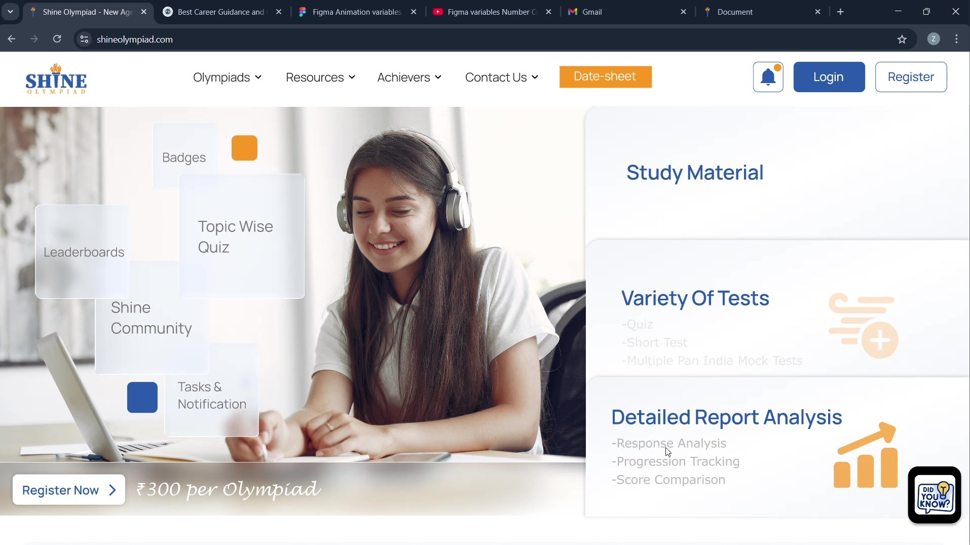
The new hero replaces the stock photo with a real student at work, surrounded by the features that actually matter — badges, leaderboards, community, tasks — instead of stating them as a separate list further down the page.
Study Material, Variety of Tests and Detailed Report Analysis sit beside it as the direct pitch, with the price stated up front rather than buried in a registration flow.
 HOVER FOR MOTION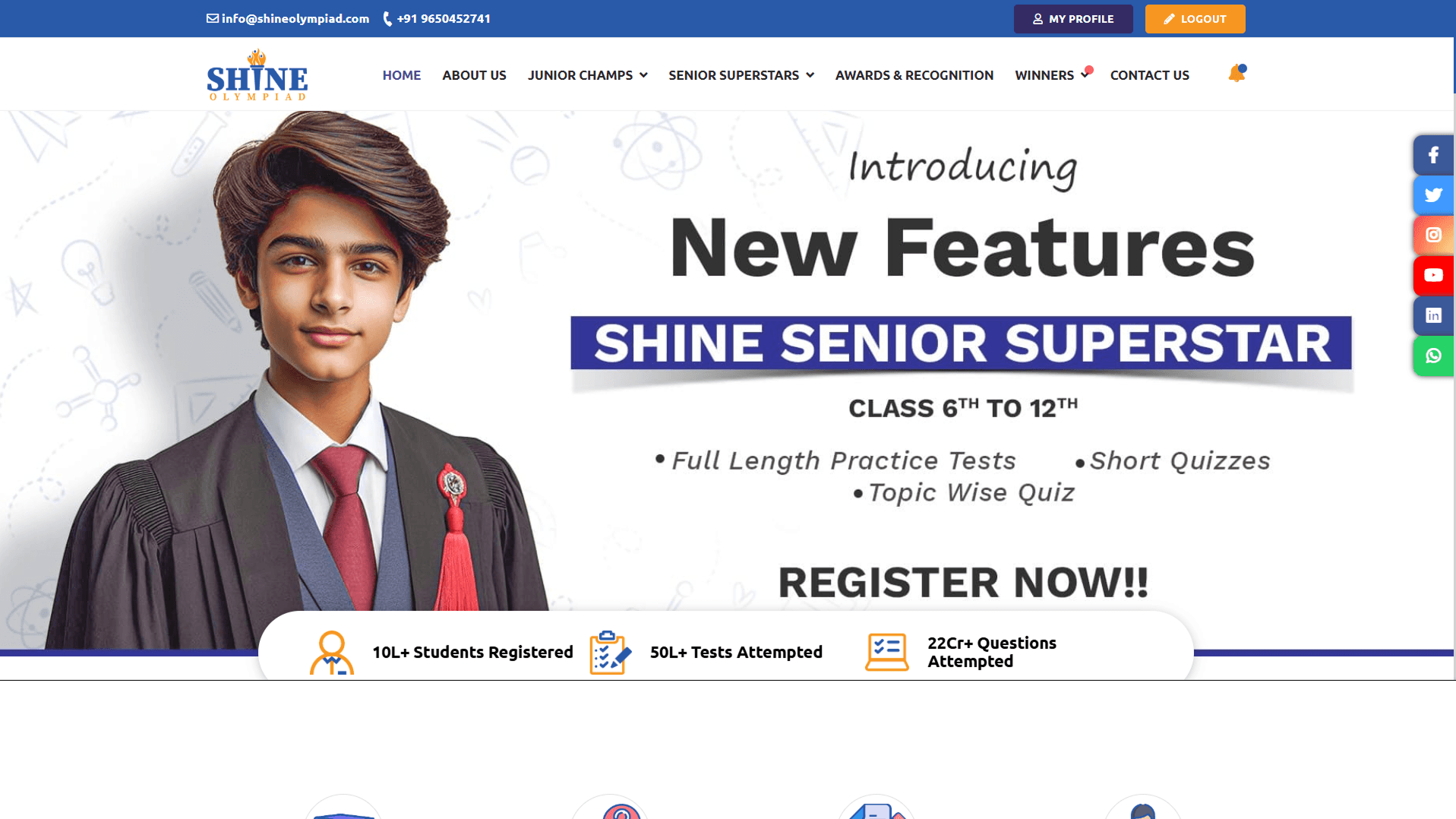
04 / INSIDE PAGES
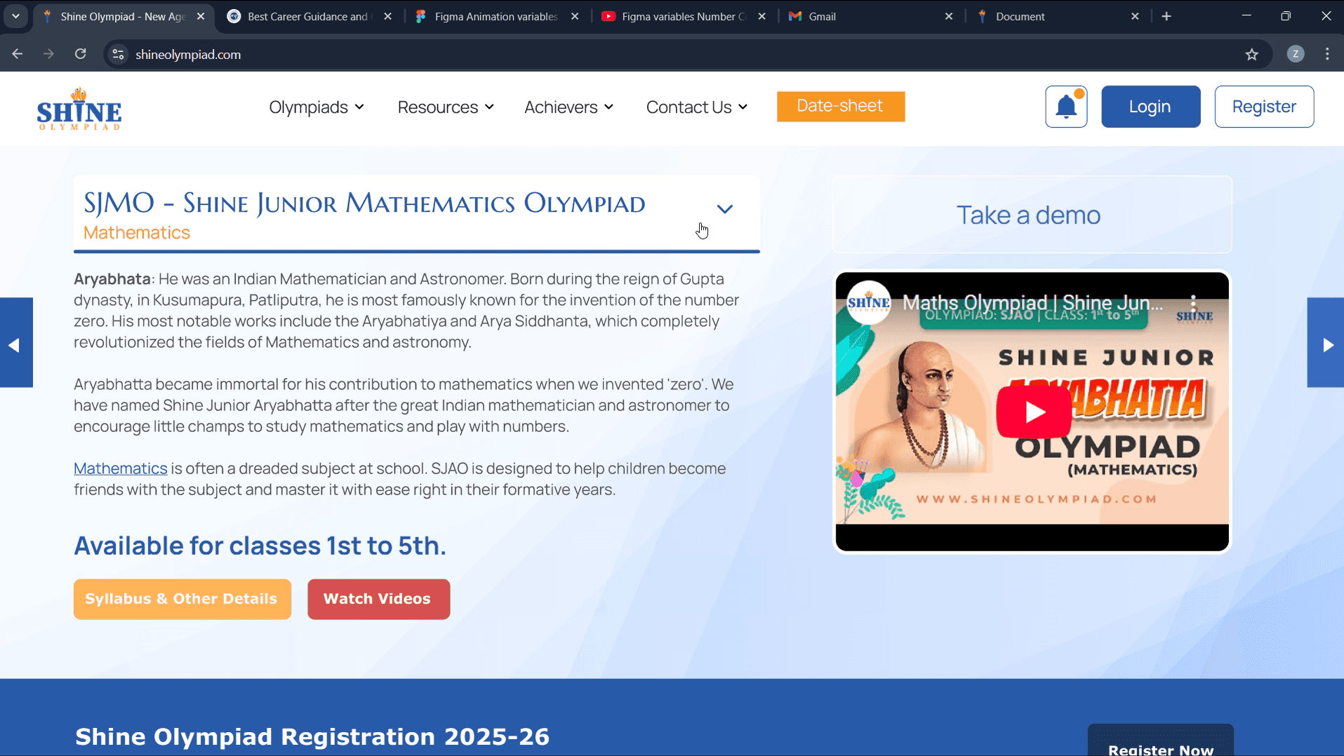
The supporting pages share one clear product language: olympiad discovery, registration, progress and recognition are all visible without asking a parent or student to relearn the interface.
05 / THE DASHBOARD
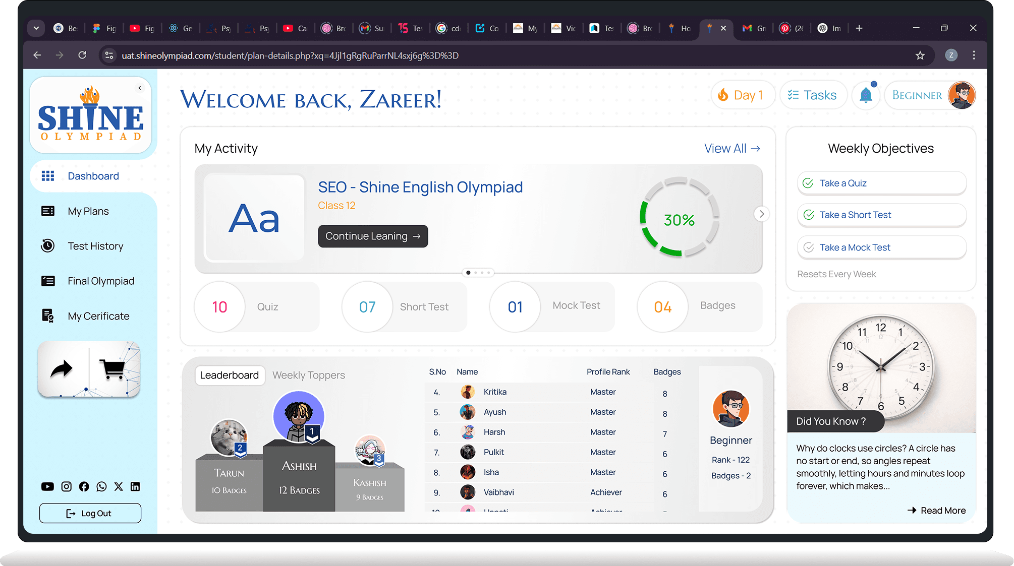
The old dashboard told a student their username, password and a registration date — none of which they needed after the first login — beside a "Test History" heading with nothing under it.
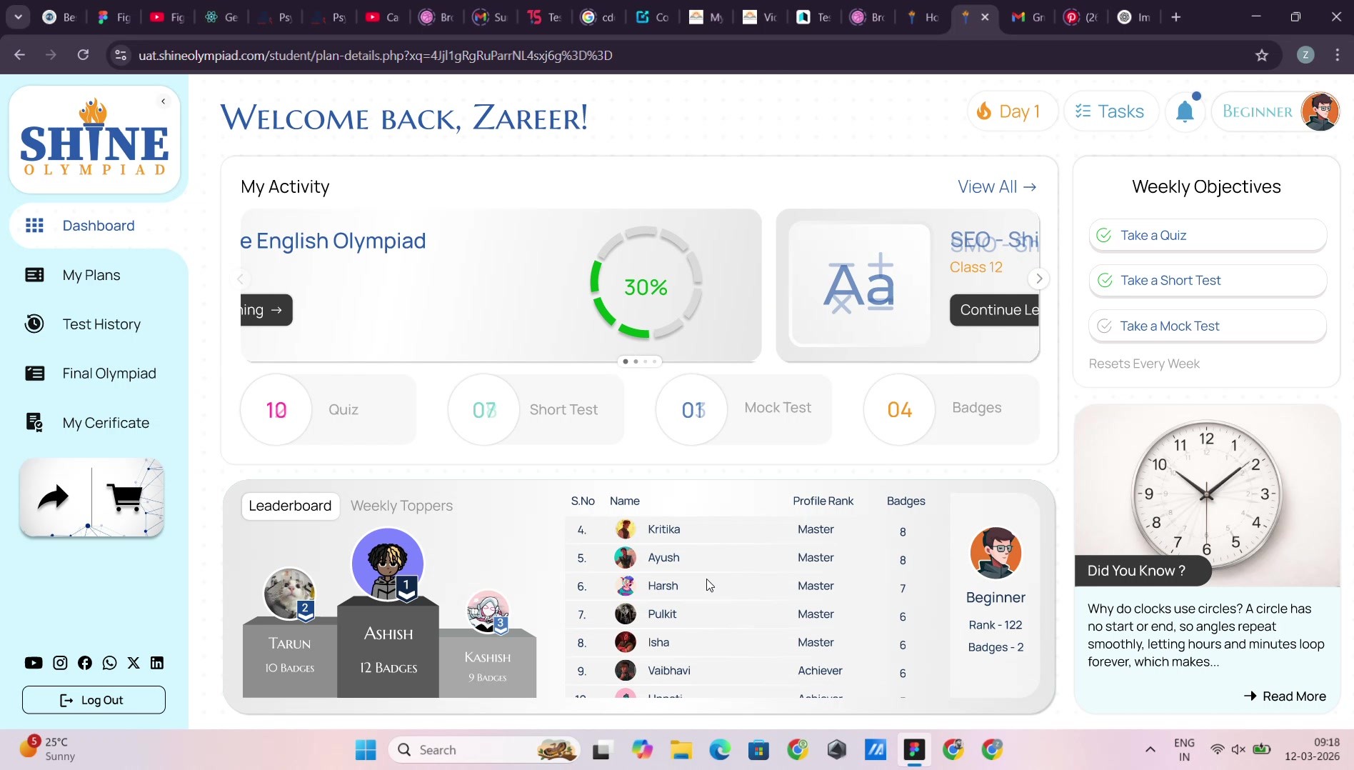
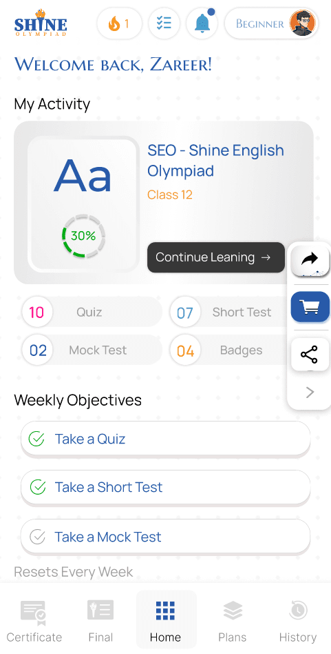
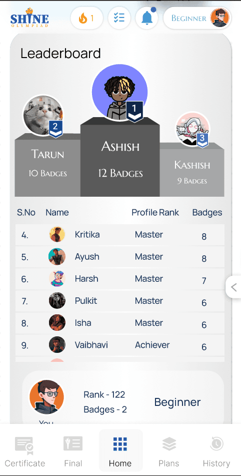
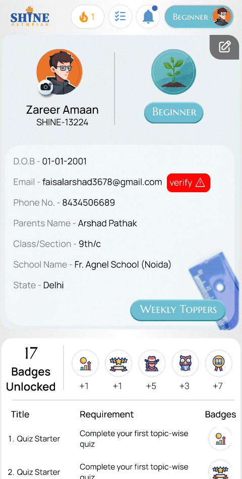
The rebuild leads with what's actually in progress: a streak counter, the active olympiad with a one-tap "Continue Learning," a leaderboard, and weekly objectives that reset every week rather than sitting static.
 HOVER FOR MOTION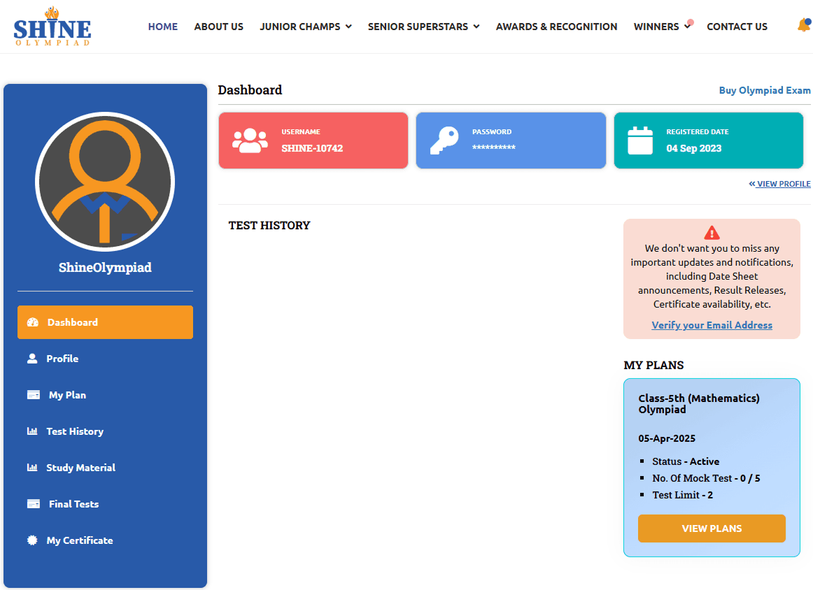
06 / THREE PAGES, ONE SCREEN
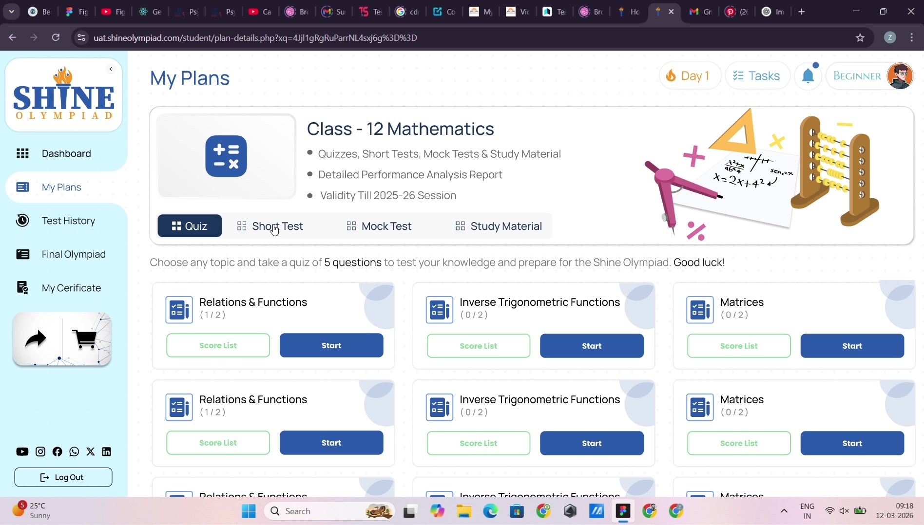
My Plan, Study Material and the subscription-status page under All Plan used to be three separate destinations for what is really one question: what am I enrolled in, and what do I do next.
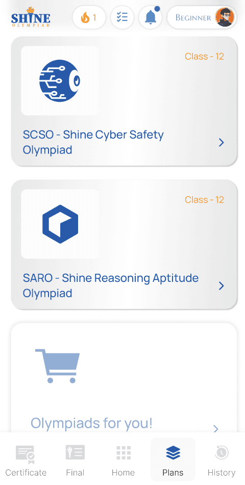
They're now one screen — the active plan on top, Quiz / Short Test / Mock Test / Study Material as tabs beneath it, and every topic showing its own score so far.
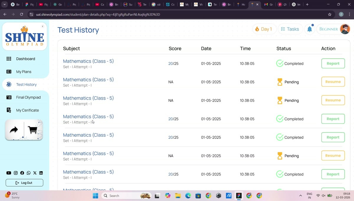
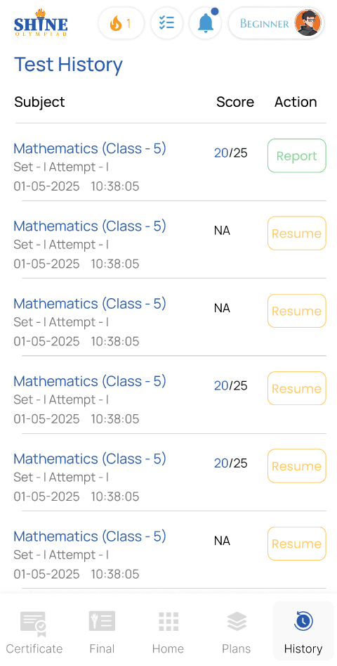
Test History. Subject, score, date, status and a resume or report action, all in one table — the exact thing the old dashboard's empty "Test History" heading was promising and never delivered.
07 / ON THE PHONE
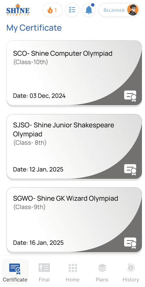
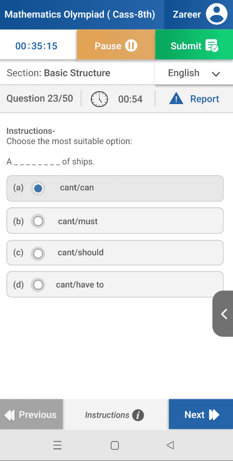
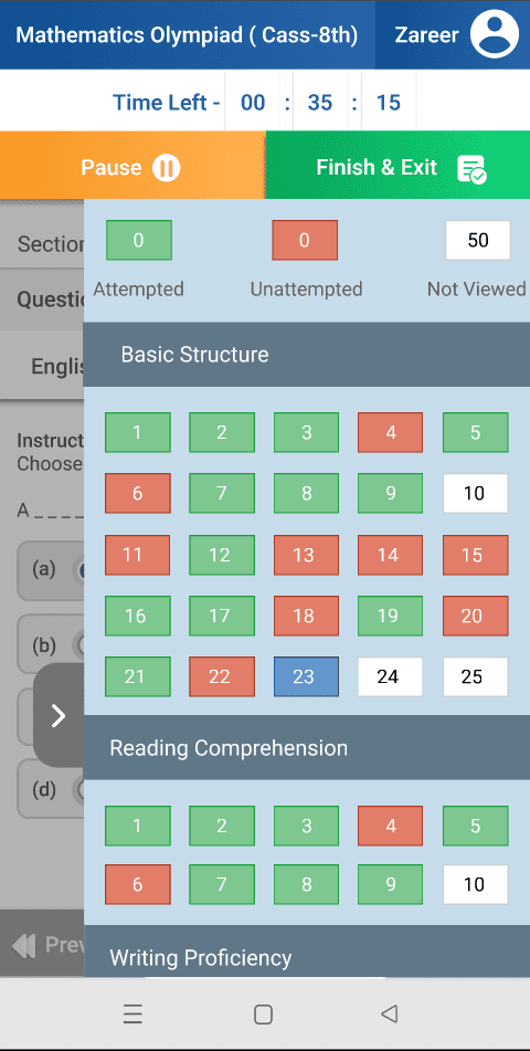
Dashboard, plans and the live exam keep the same system on a smaller canvas ? one uninterrupted rail, built for a thumb instead of a cursor.
08 / PROCESS NOTE
The hardest part wasn't any single screen — it was treating the site, the dashboard, and the exam as one product with one visual language, when they'd been built as three separate ones for years.
[ This is live at shineolympiad.com. ]
HAVE A DIFFICULT IDEA?
LET'S MAKE IT CLEAR.
Delhi-based UI/UX and Product Designer specializing in dashboards, SaaS systems and design-to-production workflows.